Positioning Canberra as a global city of design

Commonly mistaken for a government initiative, the self-funded membership-based organisation Craft ACT was experiencing a positioning issue that undermined its contribution to the community and its active involvement in Canberra’s creative scene. Additionally, without set guidelines, all public-facing brand expression and promotion for the organisation’s annual Design Canberra Festival has evolved haphazardly for half a century.

Challenge

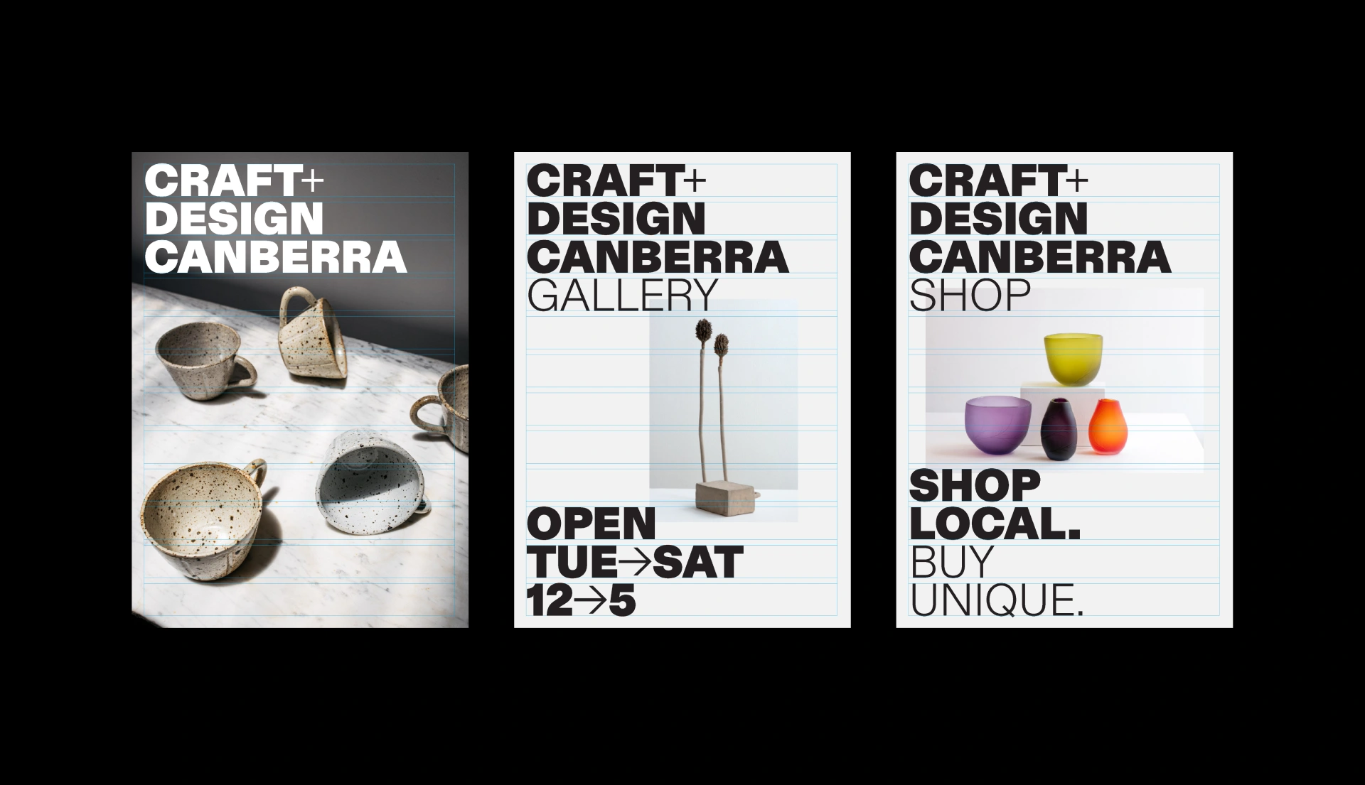
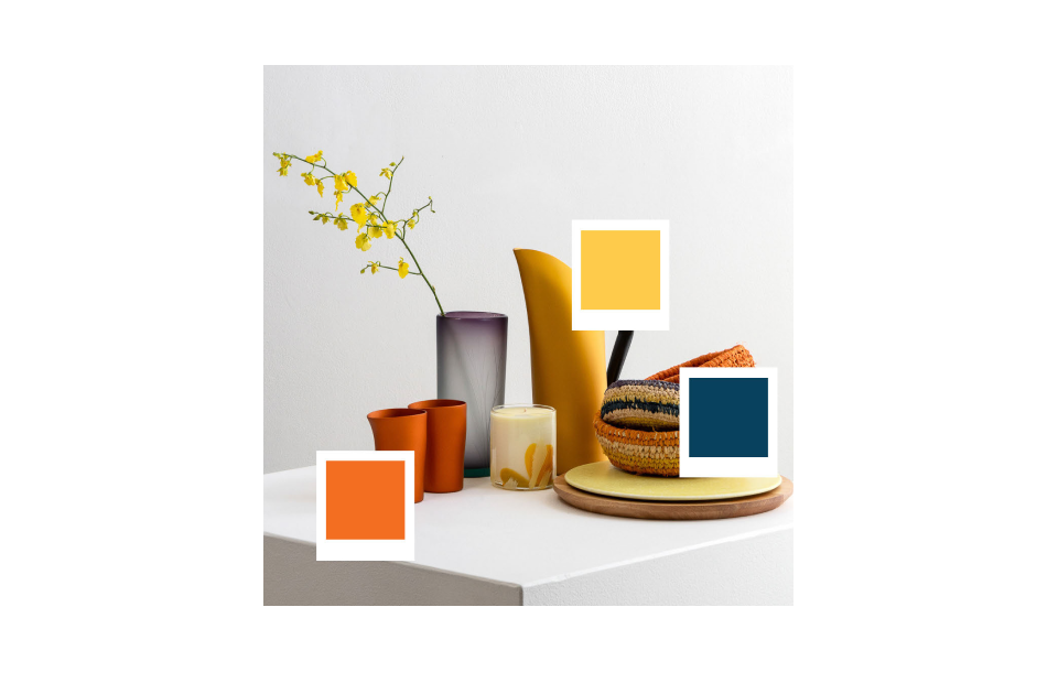
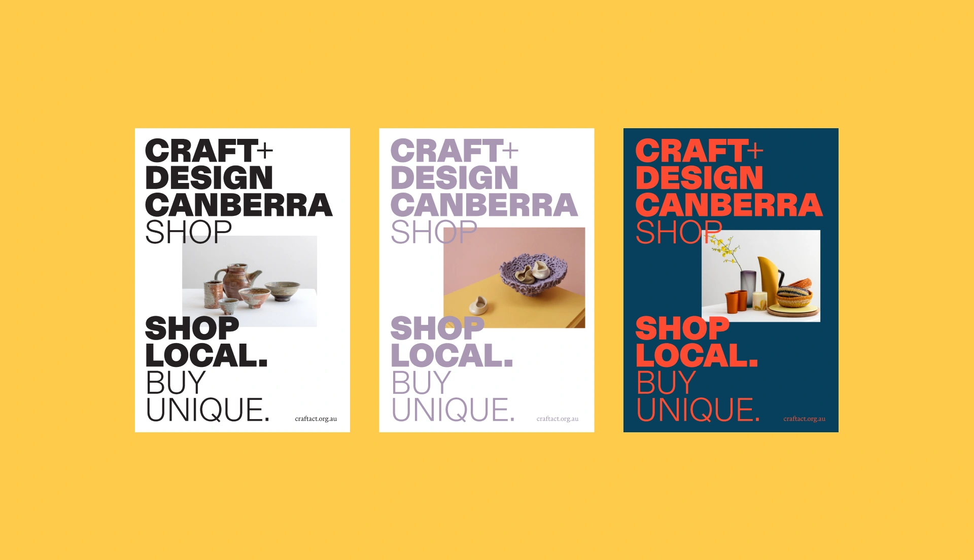
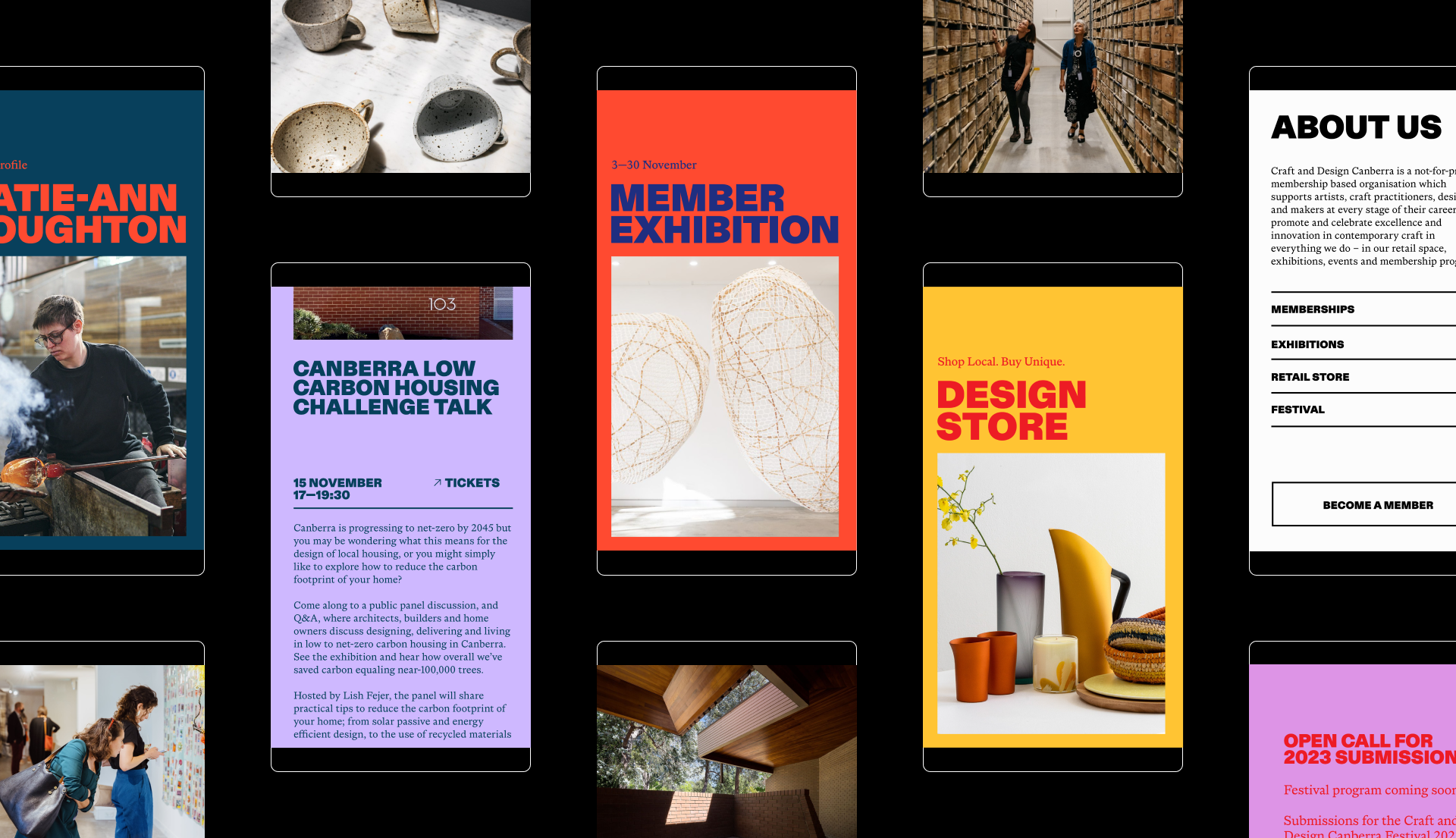
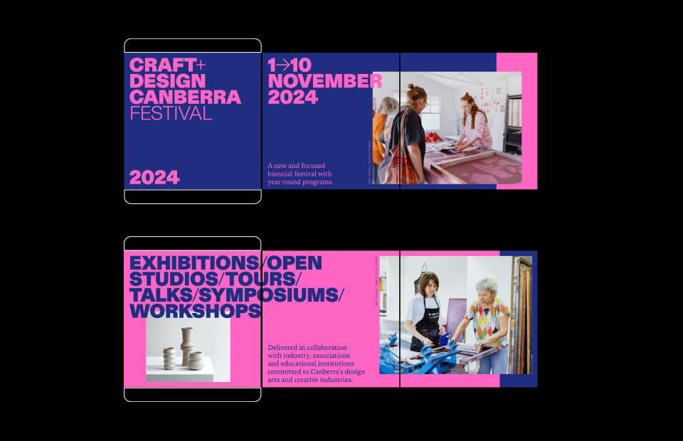
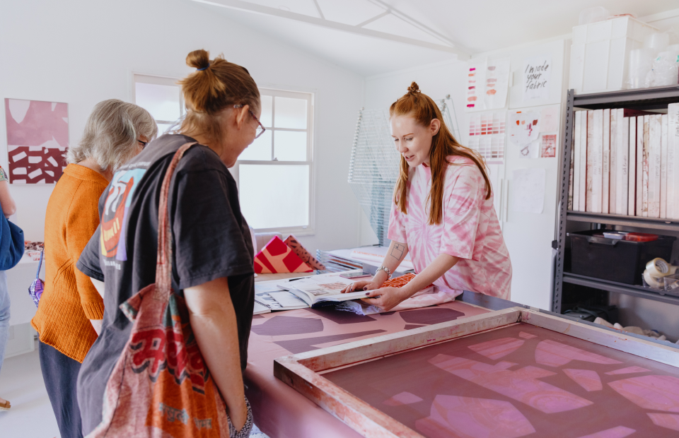
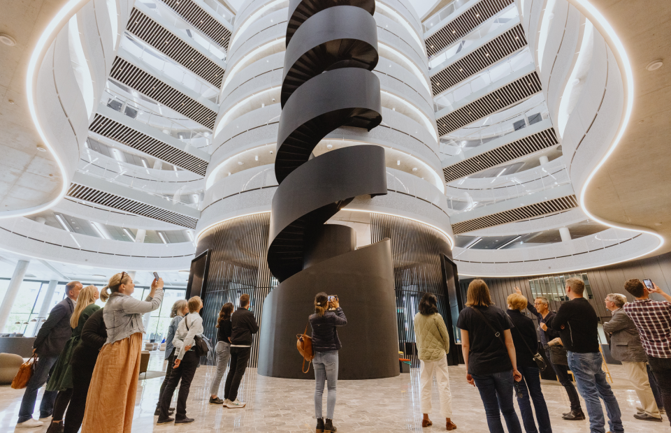
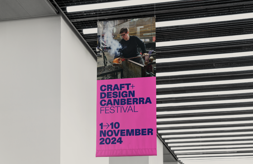
From the beginning, our north star was to position Canberra as a global city of design by showcasing Canberra’s excellence while increasing national reach for local makers. To reaffirm its influence and advocacy efforts, Craft ACT needed grounding in a more professional, unified and approachable identity. The challenge was to amplify the organisation’s 52-year legacy, consolidate the existing Craft ACT and Design Canberra Festival brands, and create a refreshed platform for its membership programs, retail space and outreach activities.

Solution

Collaborative workshops, stakeholder discussions and surveys shed light on the organisation’s inconsistent visual identity and scattershot approach to communication. Insights gathered informed the creative direction and chosen name, Craft + Design Canberra. Our strategic approach considers the longevity of the brand, with special consideration for the Craft + Design Canberra Festival, and its potential to support place branding and incentivise art tourism. We set out to design a flexible identity system with a vibrant presence. The rebrand supports Craft + Design Canberra in raising the perceived value of the ACT’s creative and gallery sector by showcasing the region’s best talent. Our solution was designed to drive sales by generating interest in and directing traffic to the Craft + Design Canberra shop

Delivery

  • Brand positioning and strategy
  • Identity and brand rollout
  • Art direction and photography
  • Event marketing campaign and templates
  • Social media strategy and development
  • Signage and marketing collateral
  • Animation

Flexible typography

The typographic approach supports a clear hierarchy, fostering recognition through repetition, while building the profile of local artists and makers within the wider community. Layouts backed by a consistent grid support strong brand recall.

Harmonious swatches

An expressive colour palette draws hues from featured imagery and artwork.

Craft + Design Canberra Festival

Bold type and vibrant colours draw crowds from all corners for the biannual Craft + Design Canberra Festival. Unique campaign-like palettes were selected to express the themes and activities of the organisation’s major outreach program each year. For continuity and engagement, creative for the Craft + Design Canberra Festival features a consistent system and a refreshed look for each future campaign.