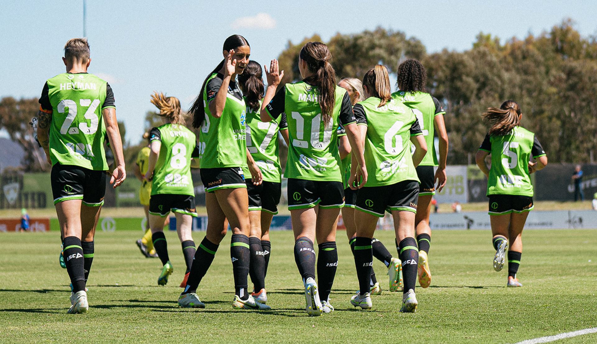
Due for a brand refresh, Canberra United approached Inklab to bring its proud heritage into the digital world. The existing identity was inconsistent, a little dated and difficult to reproduce with legibility from the pitch to the screen.
Canberra United Football Club has been a foundation member of the A-League Women (formerly the W-League) since 2008. Based in Canberra, the club claims a unique position as the only squad not affiliated with a mainstream A-League franchise.
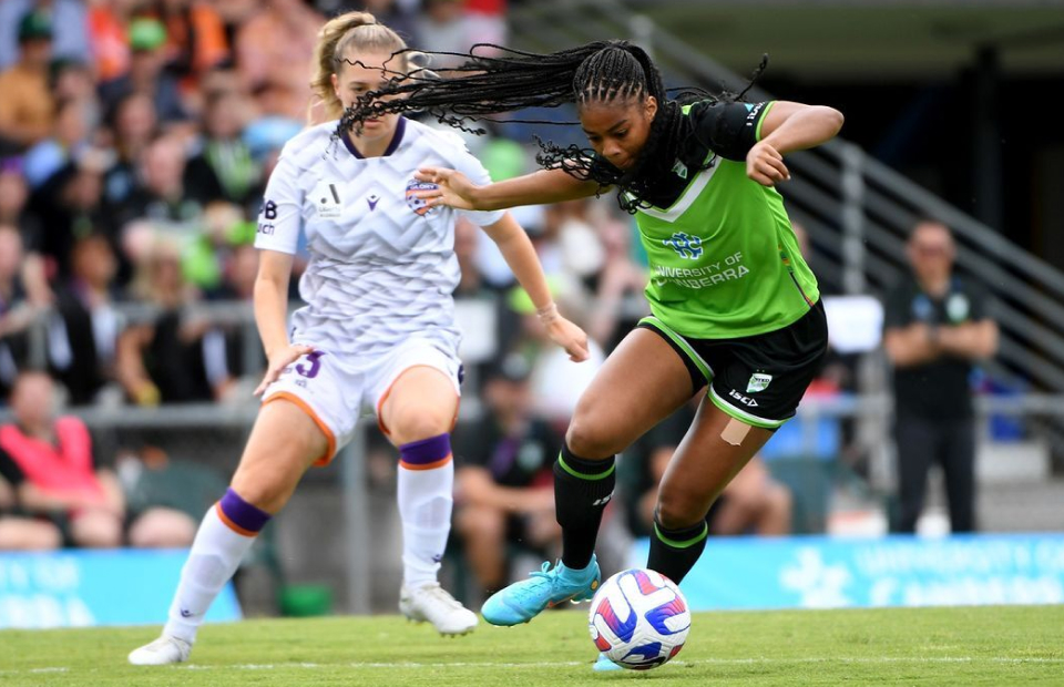
Due for a brand refresh, Canberra United approached Inklab to bring its proud heritage into the digital world. The existing identity was inconsistent, a little dated and difficult to reproduce with legibility from the pitch to the screen.
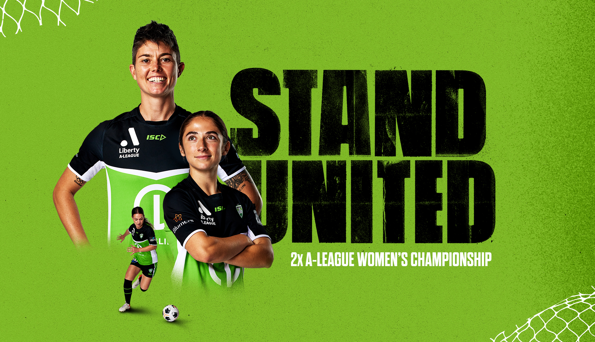
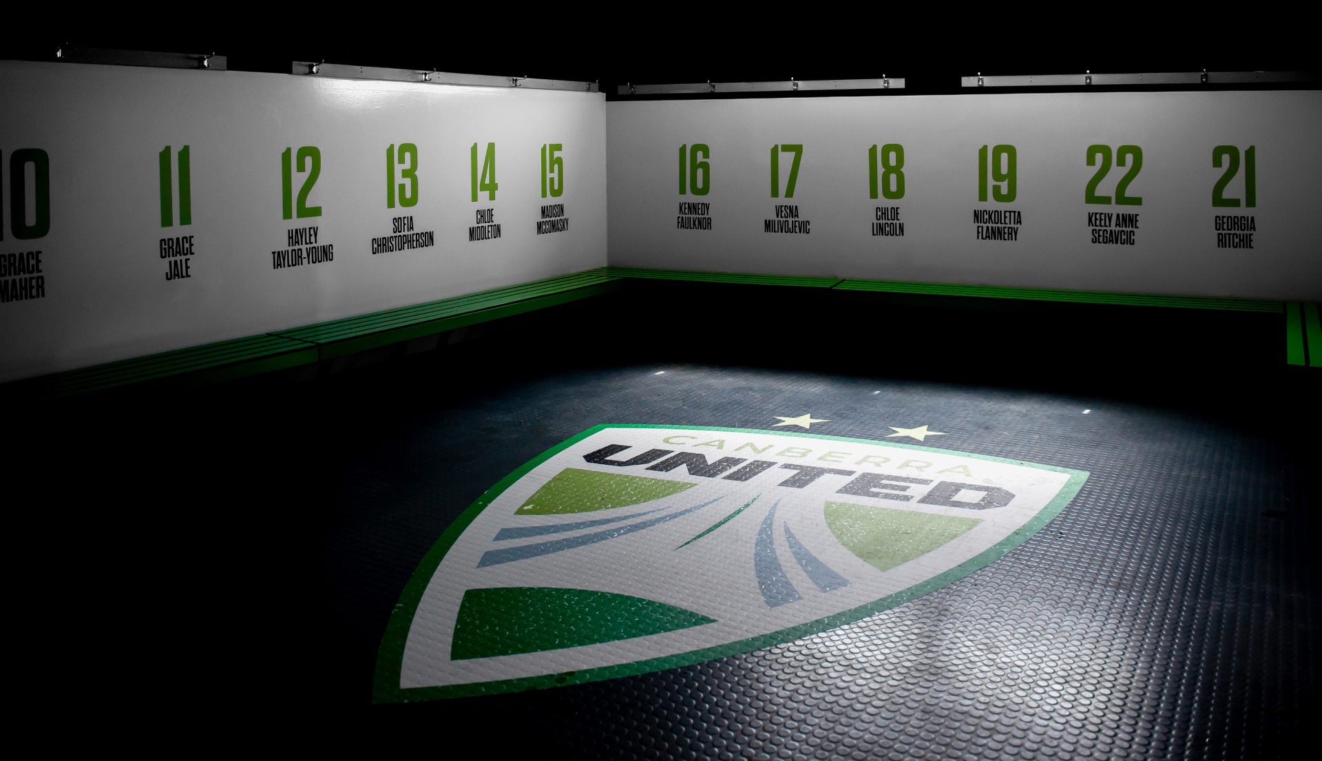
The new logo is sharp and dynamic, neatly containing the United name. The shield features a central football made up of circles and an abstract Parliament House, drawing the eye upwards. The logo balances line weights and spacing, and applies a lush and uplifting colour palette.
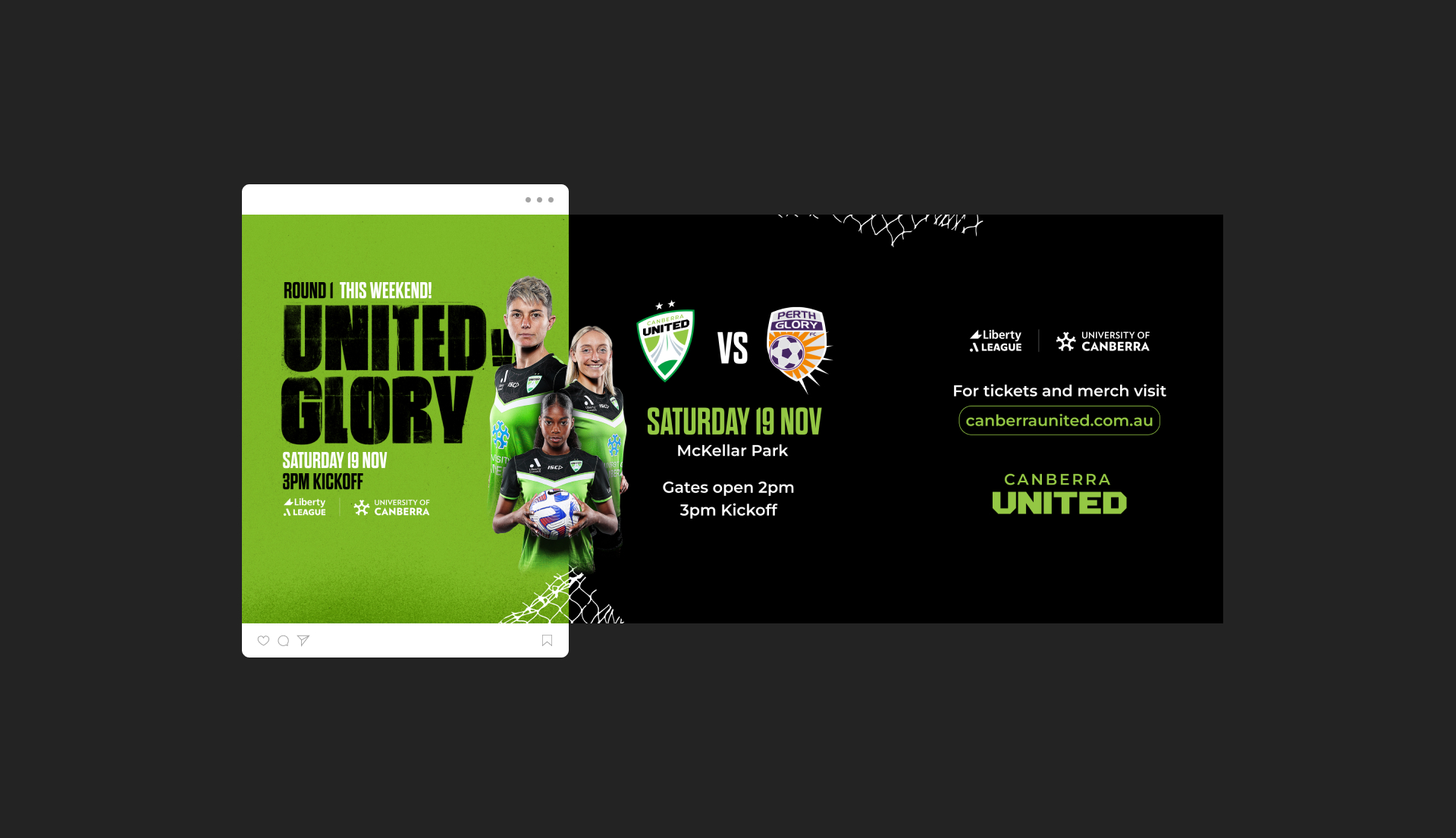
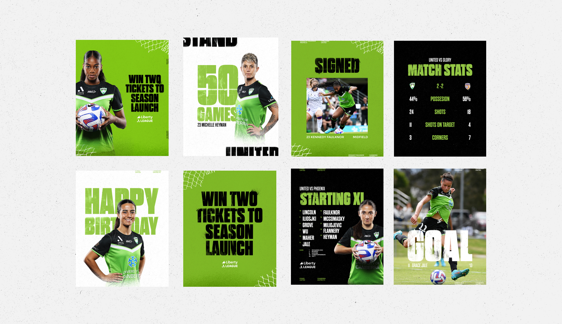
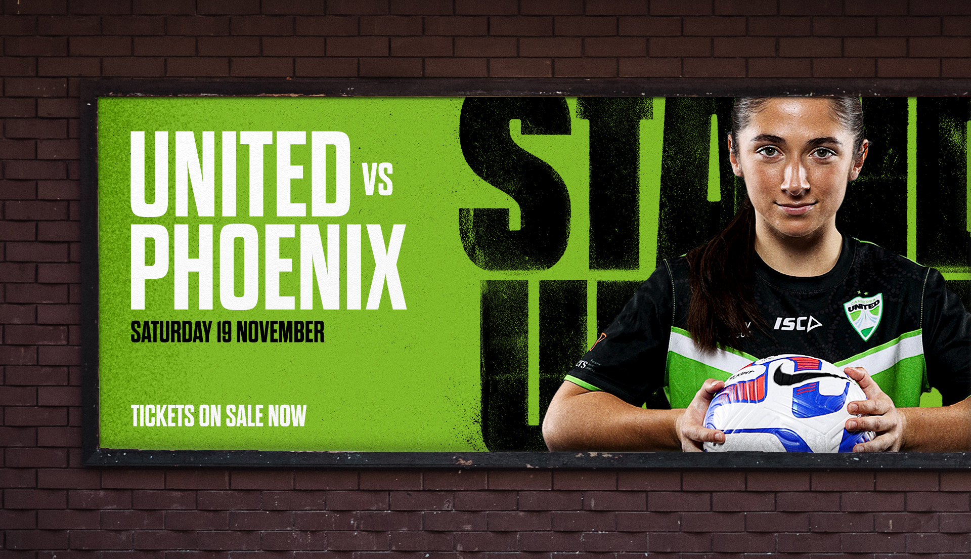
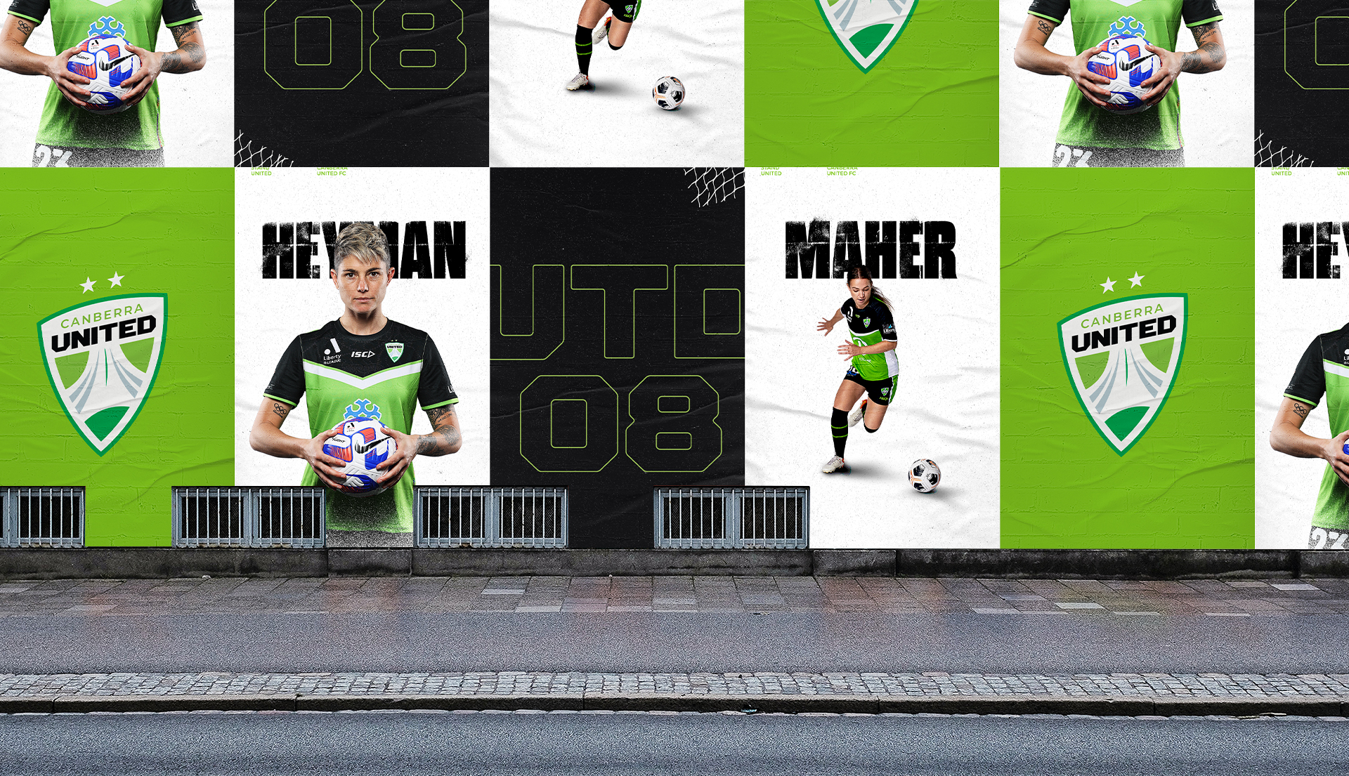
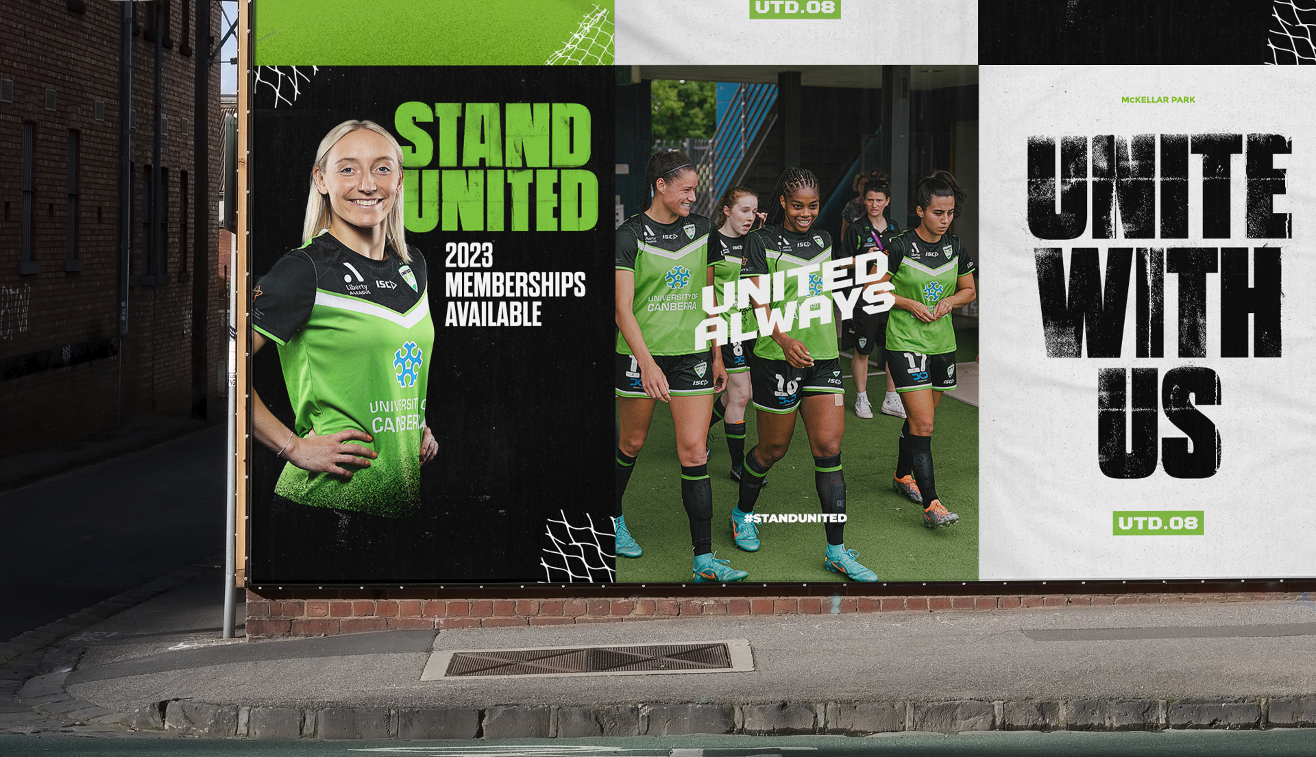
The custom typeface builds on the identity, while custom textures add grit and interest to digital assets and physical signage. The new identity reflects the modern face of the club and its supporters.

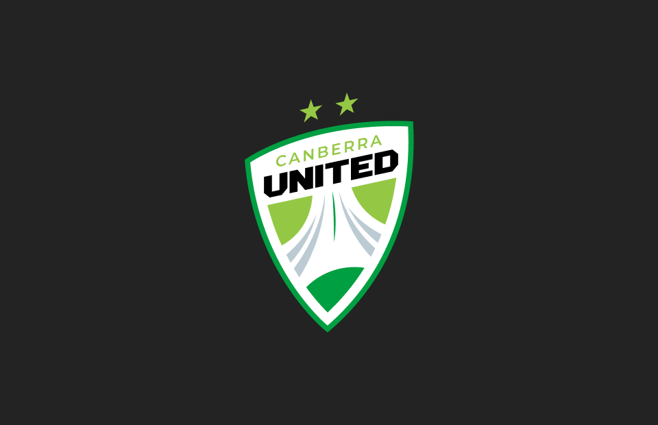
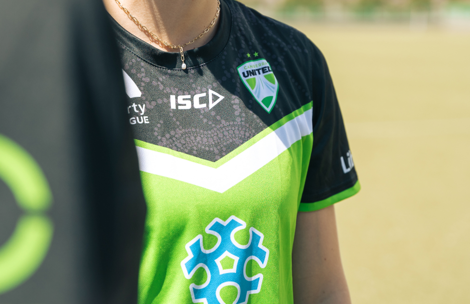
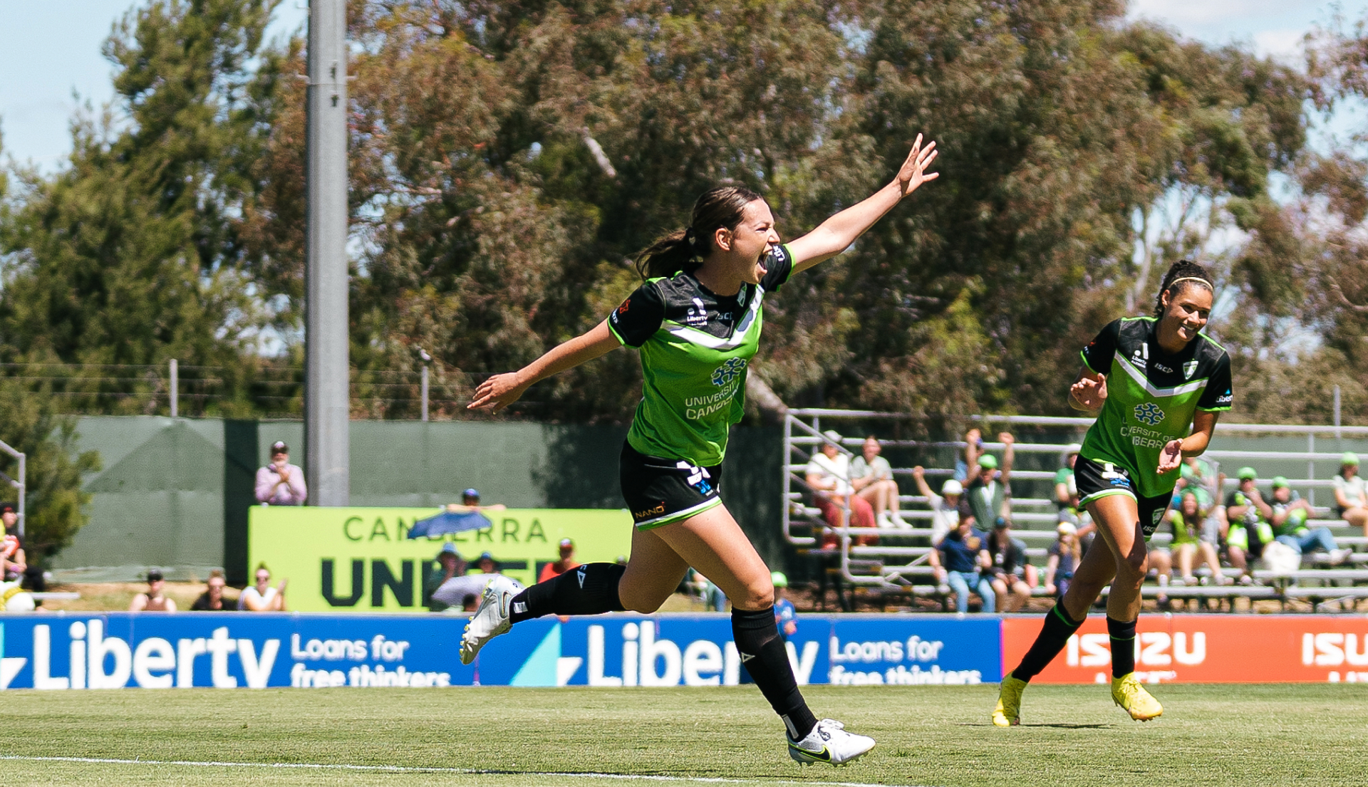
The new mark includes a bold, custom typeface that extends with a range of sub-marks and graphic devices to merchandise and season campaigns. The brand is highly adaptable and translates seamlessly with a brighter, bolder colour palette that supports the upwards trajectory of the abstract Parliament House in the shield.
