Raiders Brand Refresh

Brief

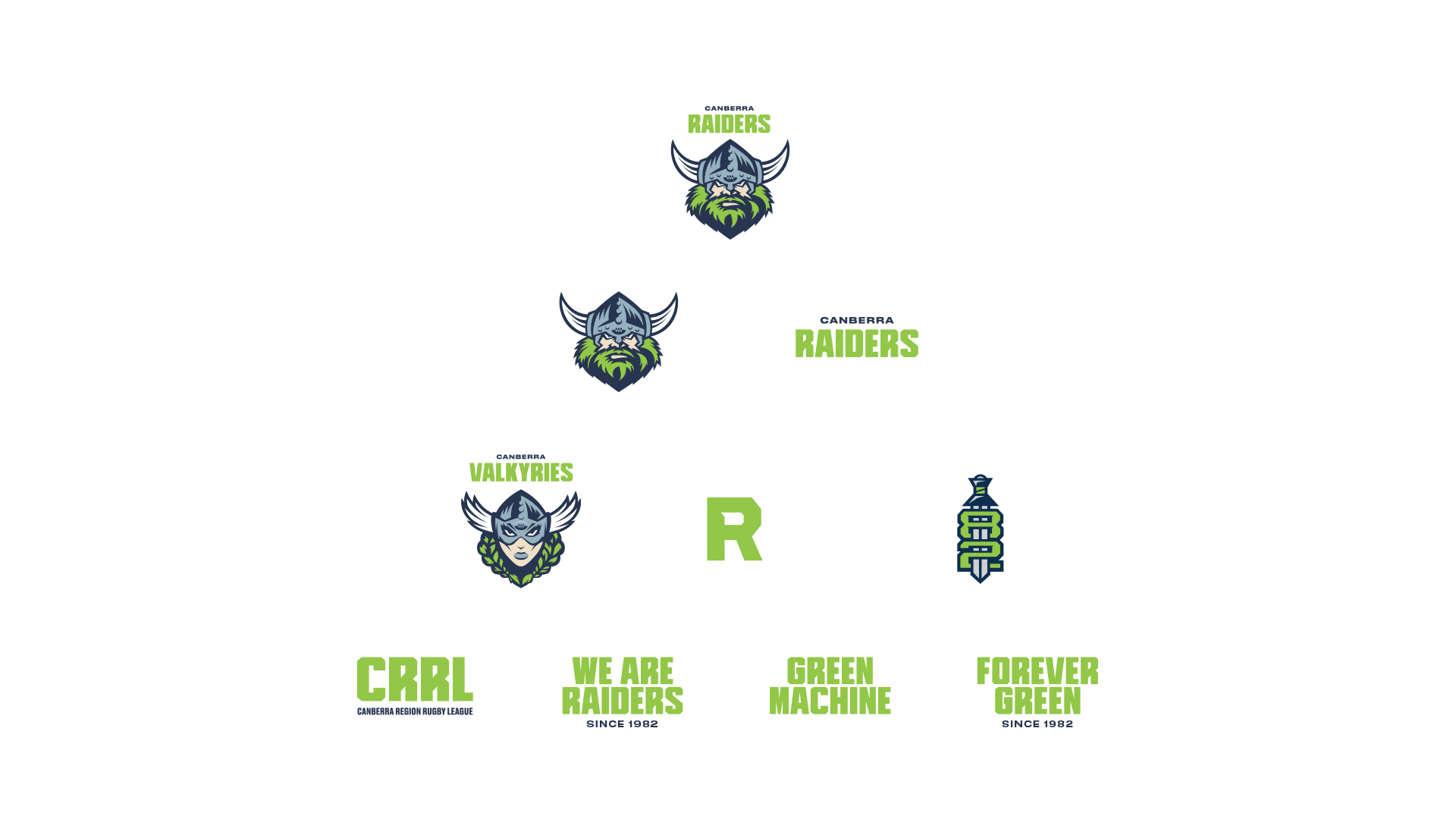
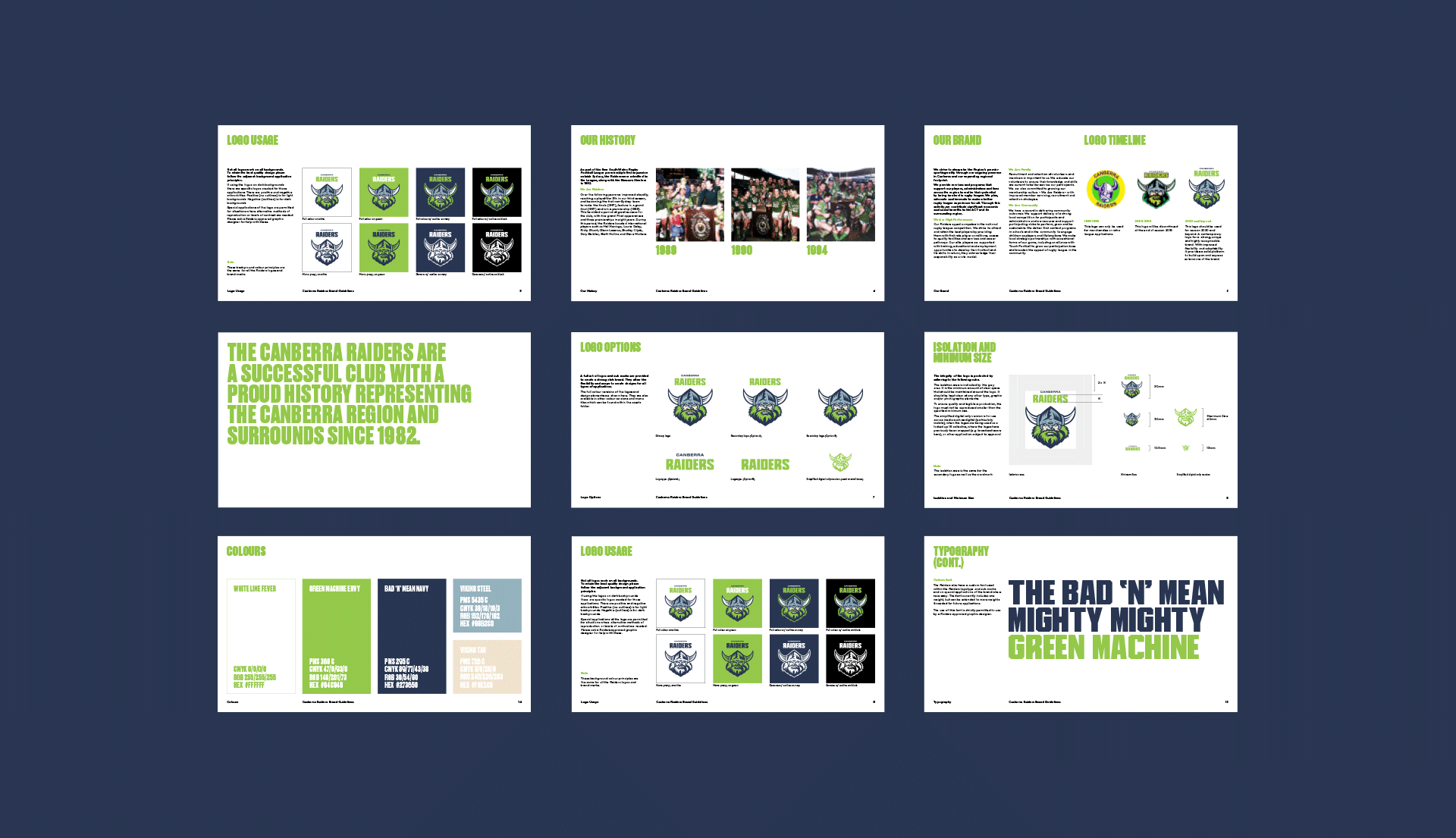
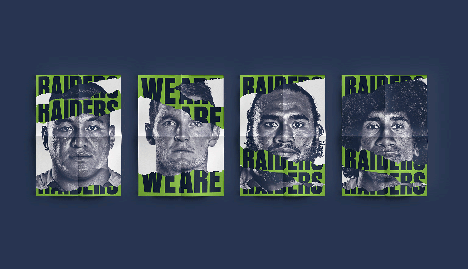
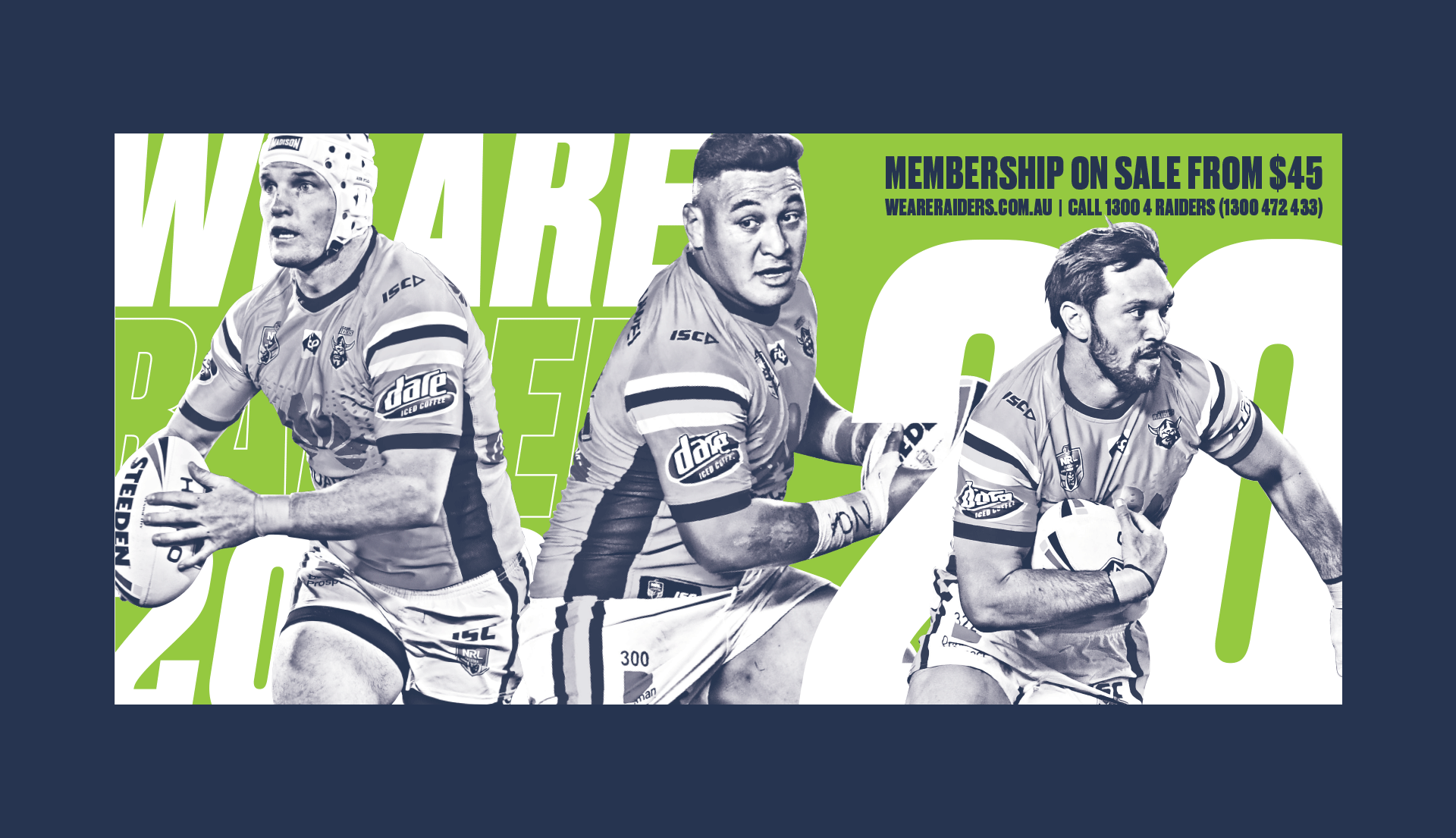
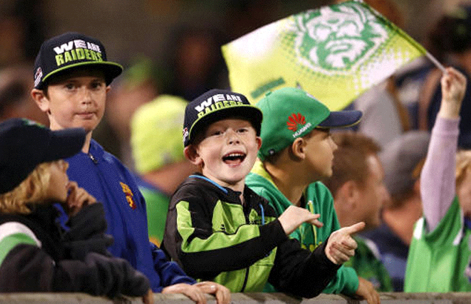
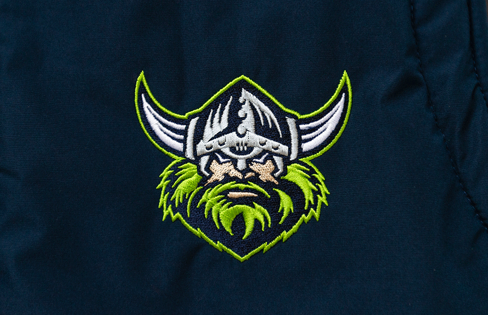
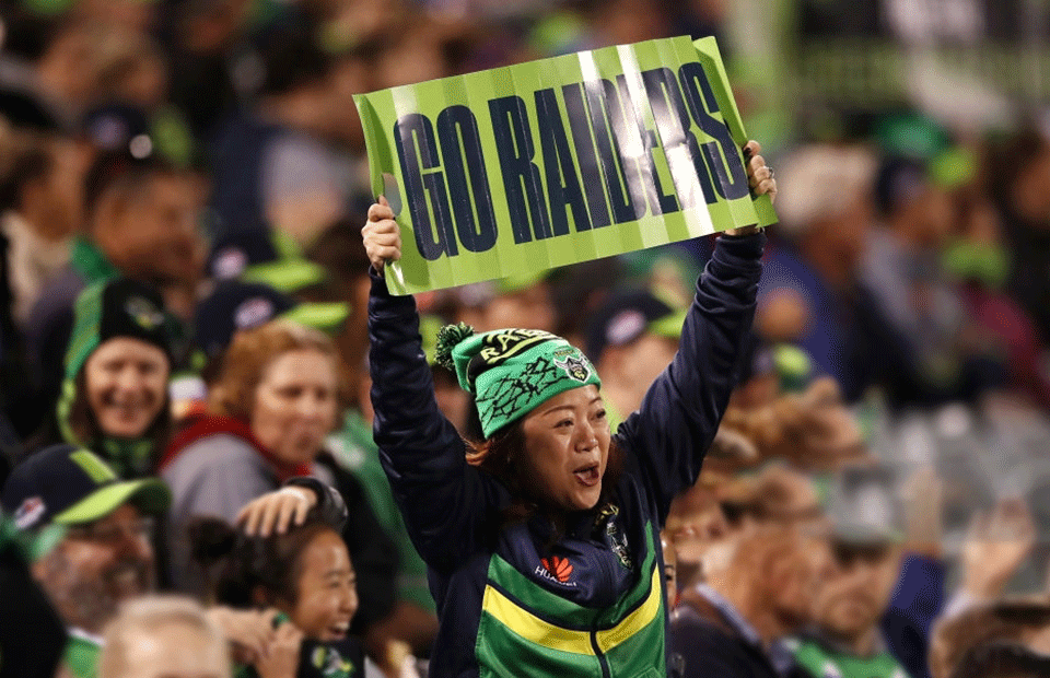
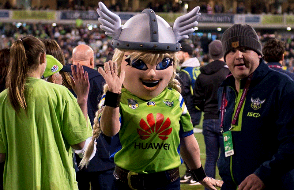
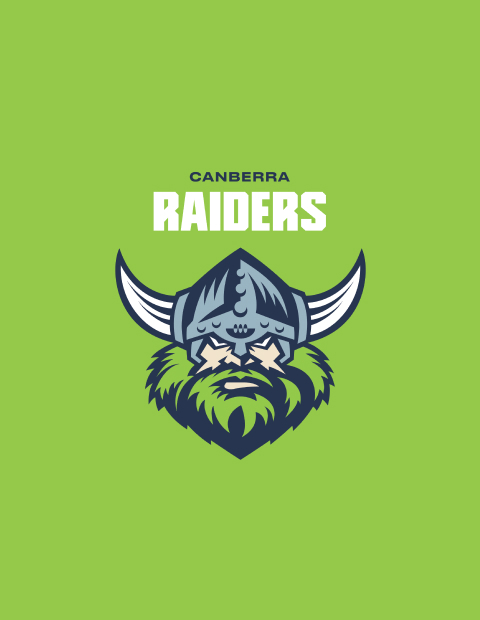
The Canberra Raiders are a professional Rugby League team, that joined the NRL in 1982 with iterations of a Viking brand with a fierce history and supporter base. The team prides itself as the outsider to the big cities. The previous logo was too complex, and colour palette too dated to hold up in the modern world of digital and broadcast. The Raiders head was used extensively for any and every instance of communication due to a lack of brand styleguide, and visual strategy, typography inconsistencies that plagued the brand’s various applications.

Solution

Inklab developed the brand, strategy and system for the Canberra Raiders and supporting organisations; including mascots, various sub-brands and the introduction of the professional womens’ team. Our rebrand focused on bringing consistency and engagement through the Raiders, organisations, and regional leagues of NSW programs. We updated the colour palette, and developed a custom typeface and supporting type family for corporate and commercial use going into the 2020 season. The new brand fully recognises the brand equity and association in the market, and takes it to the next level in all forms of communication, from jerseys through to digital and broadcast.

Delivery

  • Brand strategy
  • Identity & art direction
  • Digital strategy
  • Illustration Stationery
  • Merchandise
Velda and 1982 Sword logos
Raiders Brandmarks hierarchy
Styleguide pages
Custom font
Posters with typography and photography
Raiders billboardRaiders member packagesRaiders member lanyards
Raiders printed collateralRaiders website
Fans at game wearing Raiders merchandise
Raiders logo embroidered onto puffer vestFans in crowd wearing Raiders merchadiseRaiders merchandiseRaiders fan wearing merchandise