Seeing the possibility in everything

Turning uncertainty into opportunity through industrial design, the Alquemy team sees possibility in everything. Conceptualising products for the modern home, its work is layered with insights, strategic thinking and experimentation. The visual identity and website design distil the notion of ‘alchemy’, fostering trust in its design expertise. 

Challenge

Founded on a diverse background of in-house and consultancy experience, Alquemy has fine-tuned a scalable design process that applies a versatile toolkit layered with insights and strategic thinking. The team understands the complexity and needs of real-world businesses and has an established reputation for tailoring its approach to yield innovative and iconic results for each client.

Central to Alquemy’s approach are core values that inform every design decision. Their holistic perspective ensures they design with intention for longevity and sustainability, while considering the needs of evolving brand systems. The team’s genuine passion for design culture fuels their commitment to innovation and experimentation, leveraging technical expertise and entrepreneurial spirit to identify possibilities, solve problems, and fine-tune ideas. Collaboration also plays a key role, with lasting partnerships built on strong communication and shared success. A relentless focus on craft and refinement ensures the highest quality product design, with meticulous attention to detail centred on end-user needs.

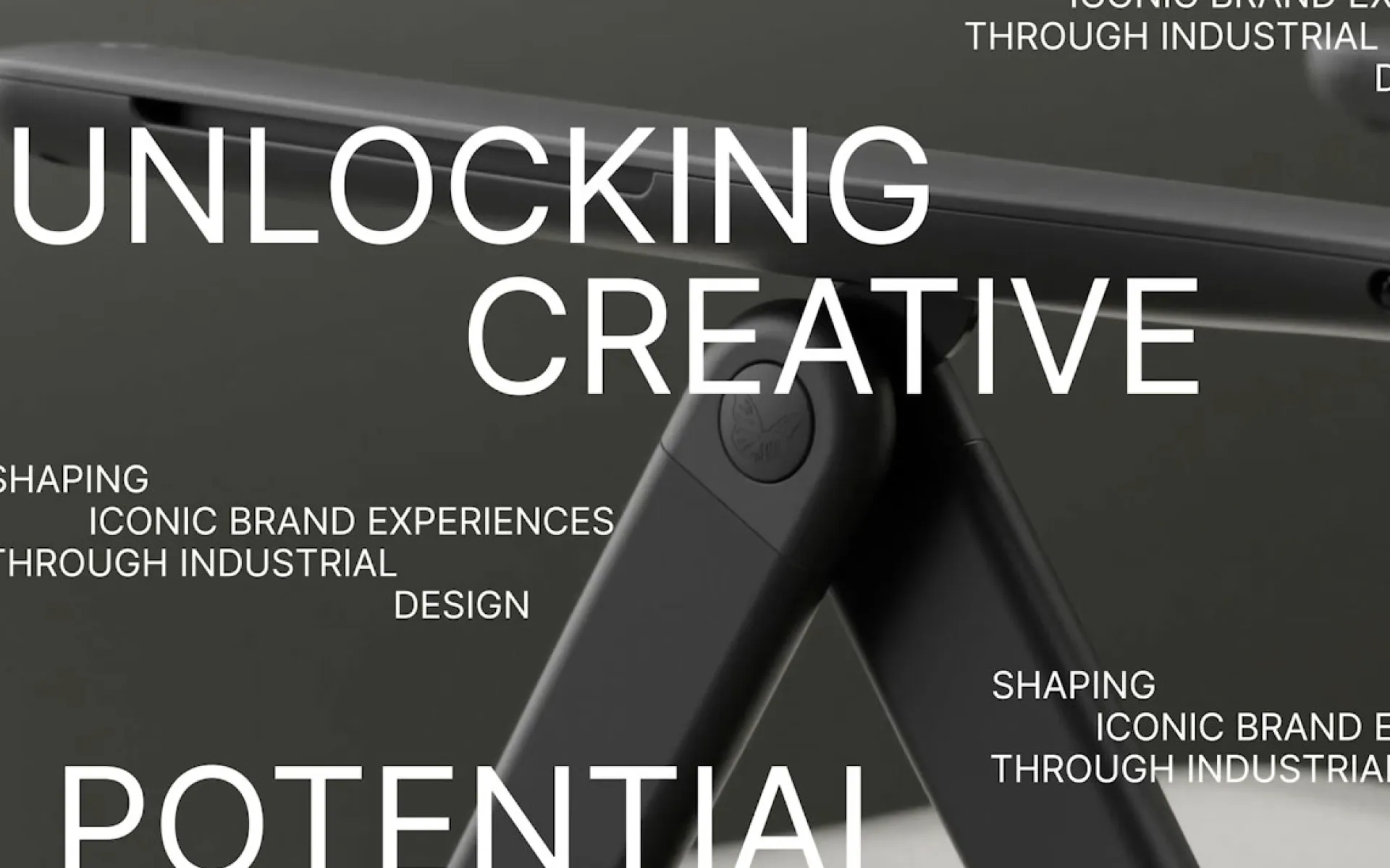
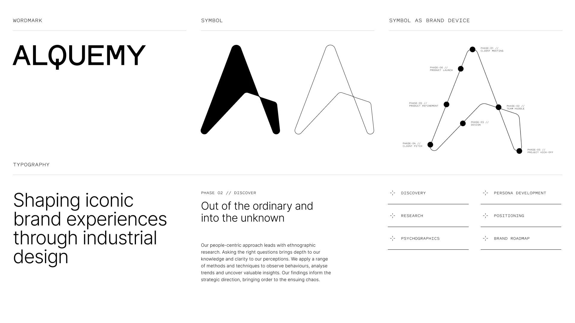
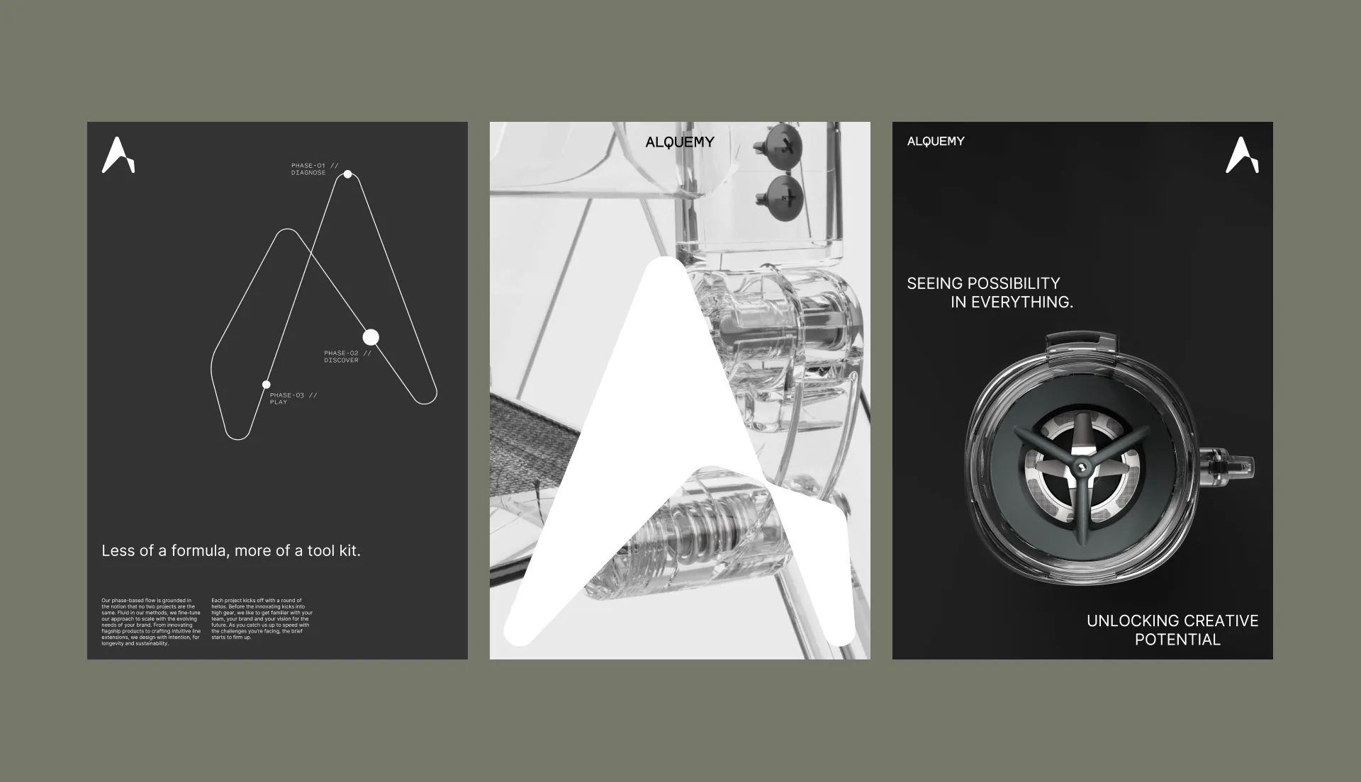
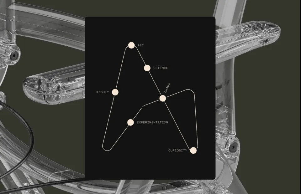
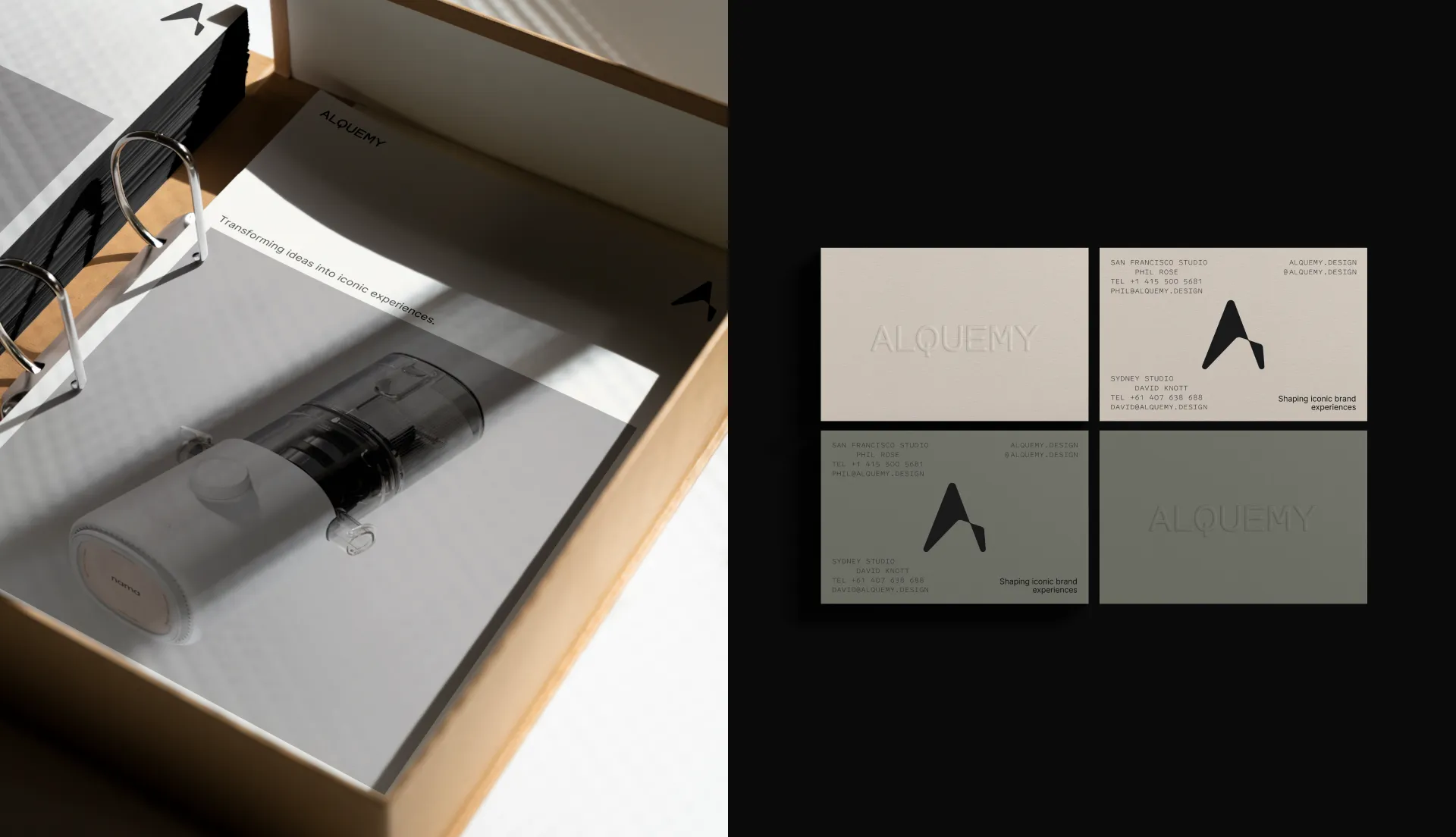
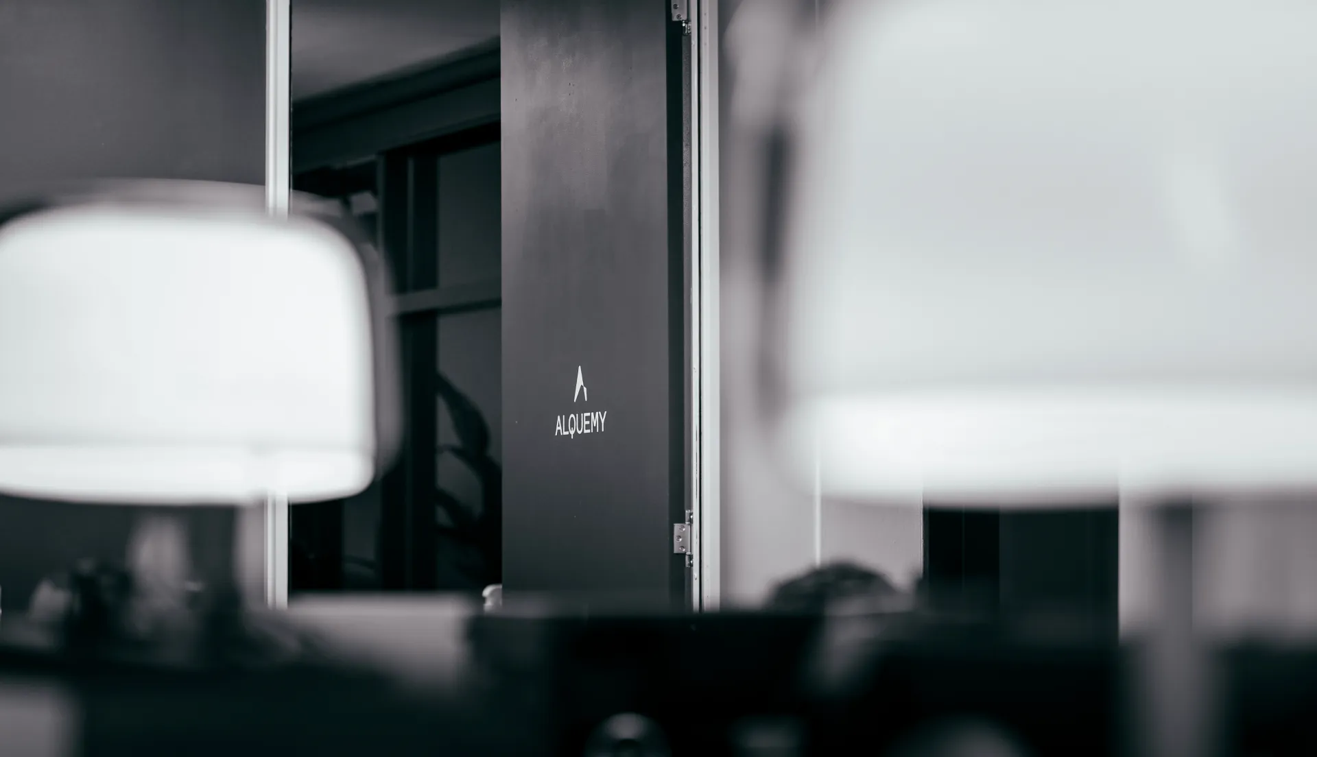
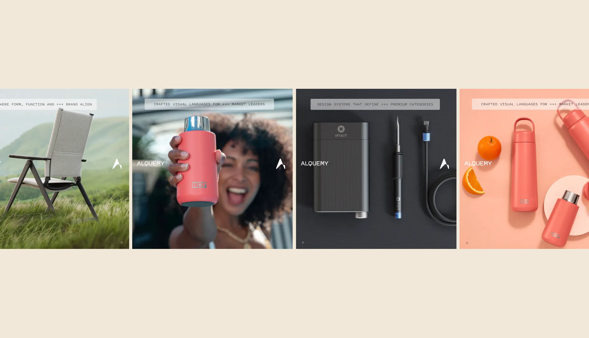
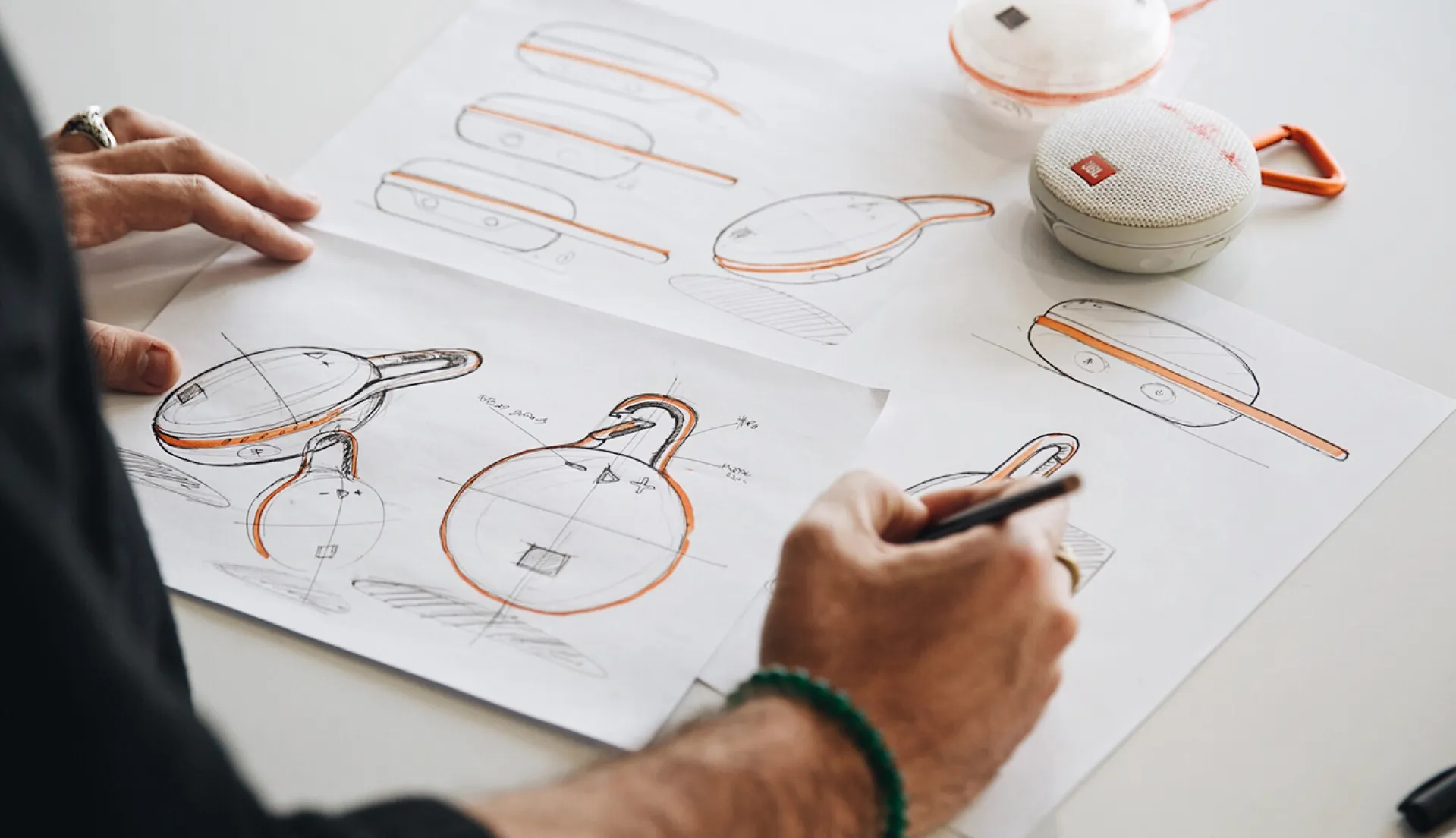
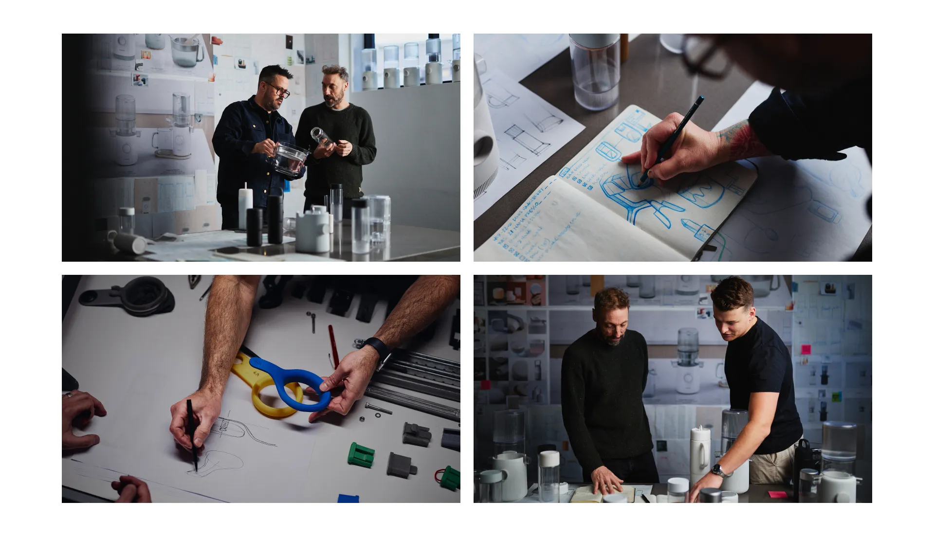
Hindered by limiting definitions of industrial design, Alquemy noted that, despite their values and expertise, their contribution to the branding process was often undervalued by clients. To develop long-term strategic partnerships and attract projects with greater creative freedom, it was necessary to redefine and reposition the role of industrial design itself.

Solution

The brand identity embodies a dynamic sense of movement with a flexible system combining mark, wordmark, typography, imagery, colour and motion. The mark captures the unique blend of organic and digital worlds that Alquemy explores, while the wordmark complements this by expressing intelligence and thoughtfulness, most notably through the ‘Q’ letterform, which subtly references an on/off button familiar in home and appliance products. The line work logo alternate reflects Alquemy’s core ethos of experimentation and adaptation, ensuring the shifting proportions of the ‘A’ are clearly visible yet instantly recognisable, conveying a strong sense of change and innovation. Together, the logo mark and wordmark strike a precise balance between flexibility and utility. Beyond a static symbol, the logo mark evolves into a versatile brand system, serving as a tool to clarify complex processes and concepts. This visual approach firmly positions Alquemy within the realm of high-end technology.

Delivery

  • Brand
  • Positioning
  • Art Direction & Photography
  • Copywriting
  • Website
  • Social