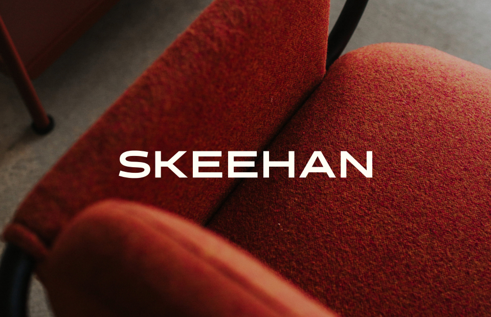
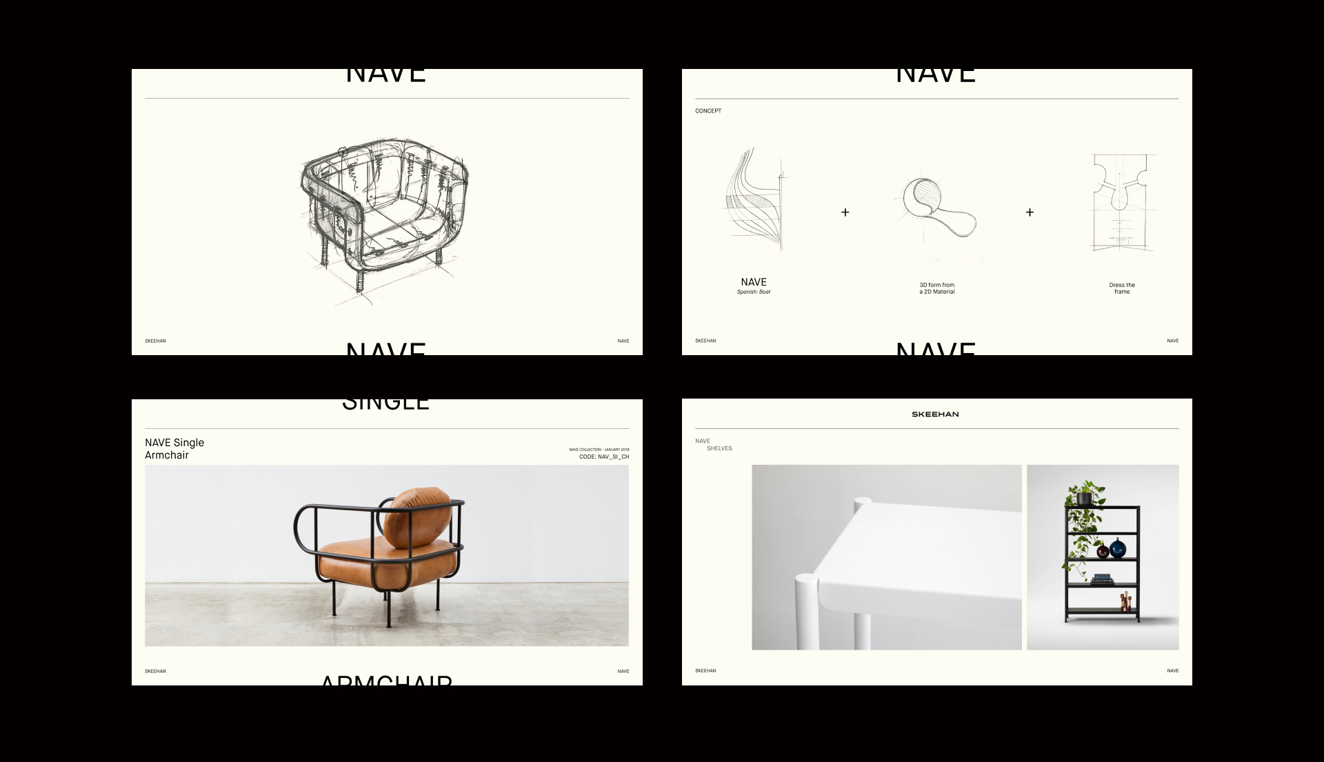
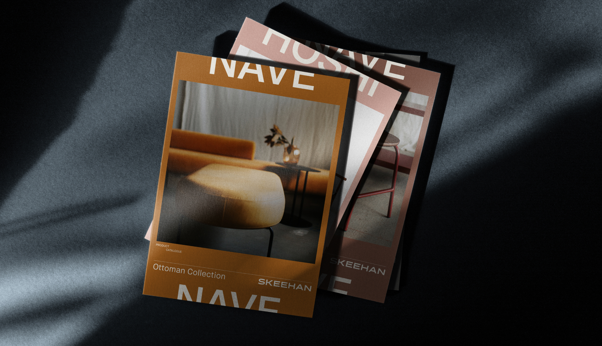
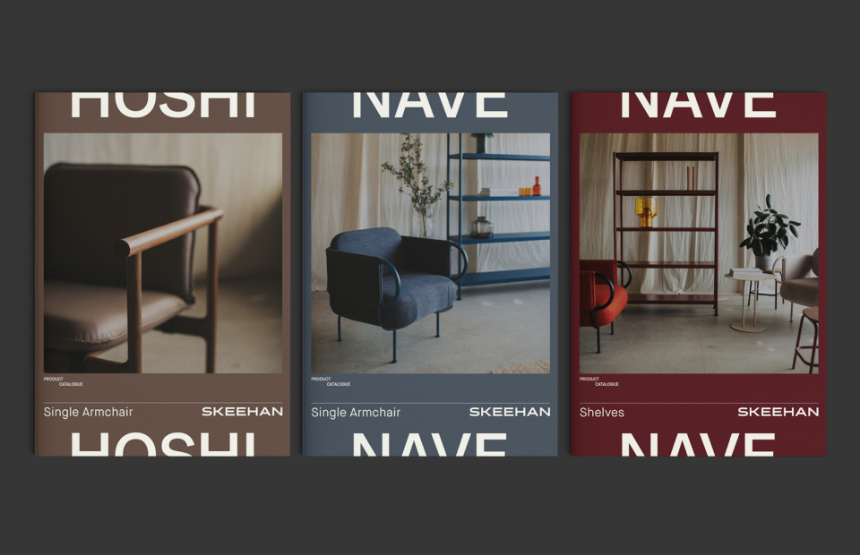
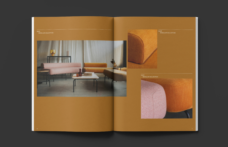
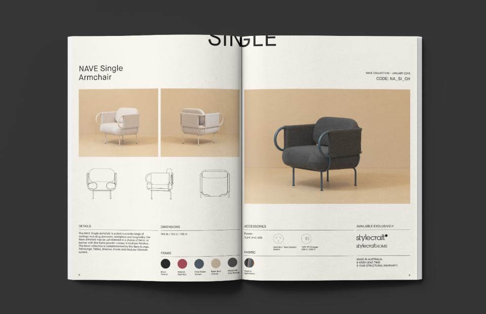
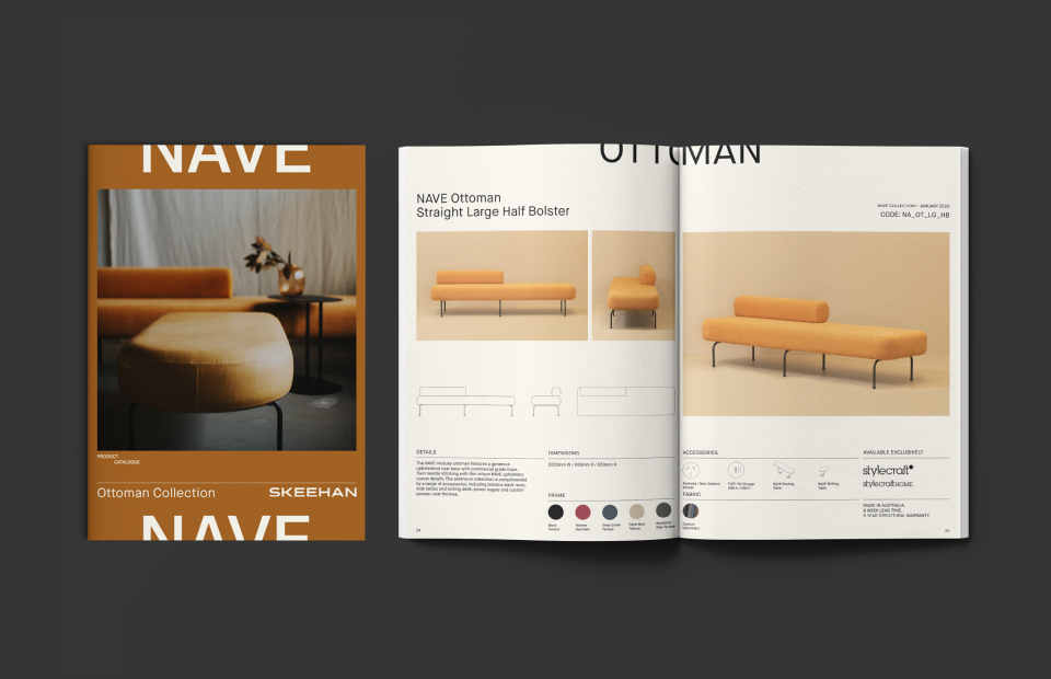
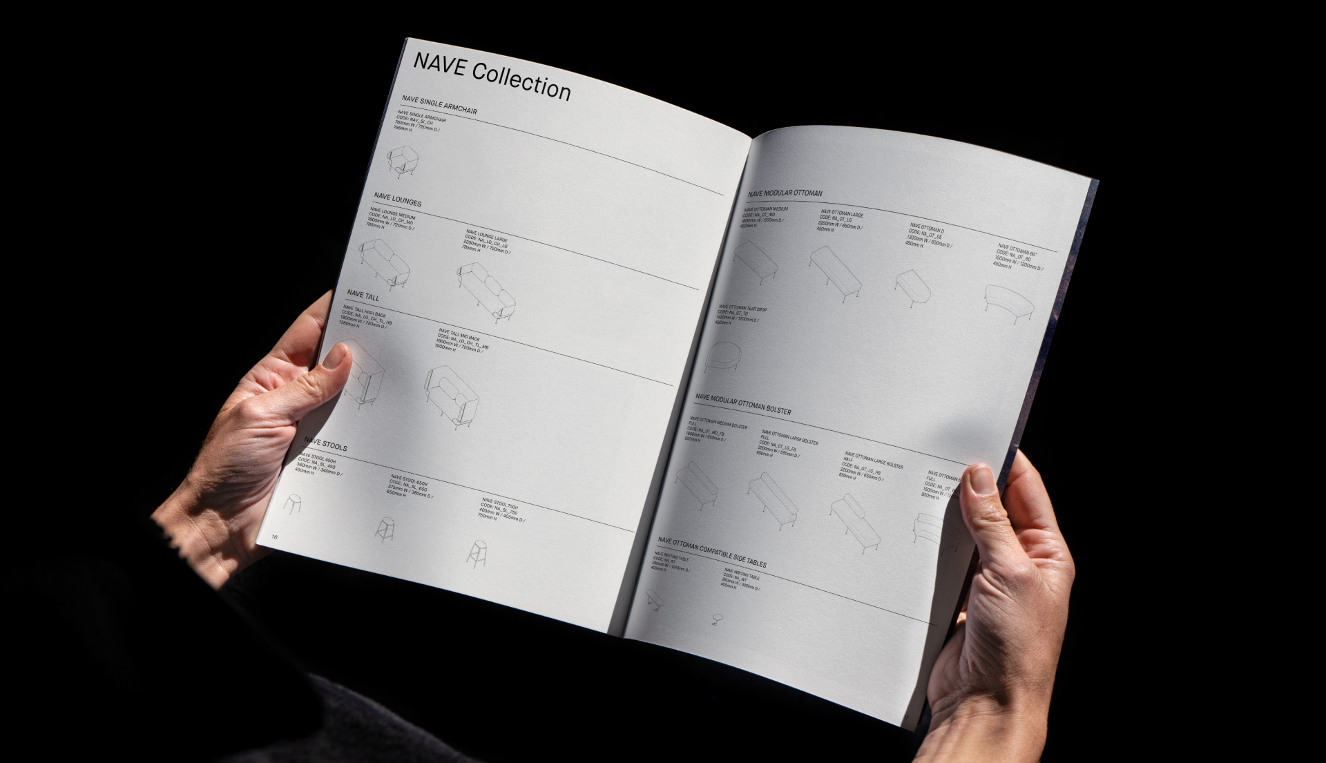
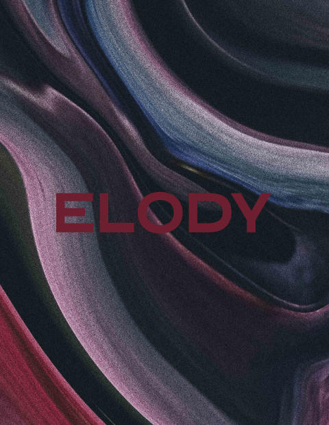
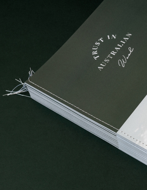
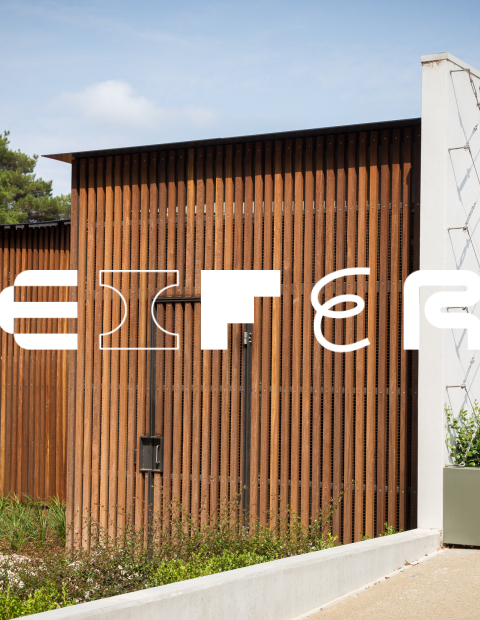
The concept explores the team’s unique and restrained approach to brand, research, positioning and materiality. A new graphic system, custom typography and branding guidelines reinforce the intelligence of Skeehan’s methods.
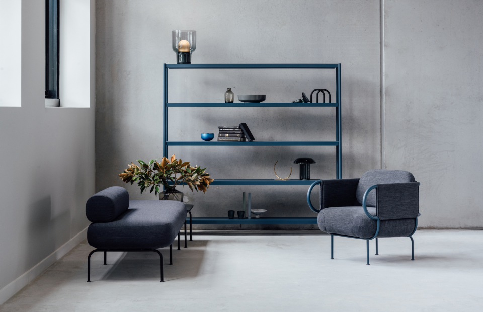
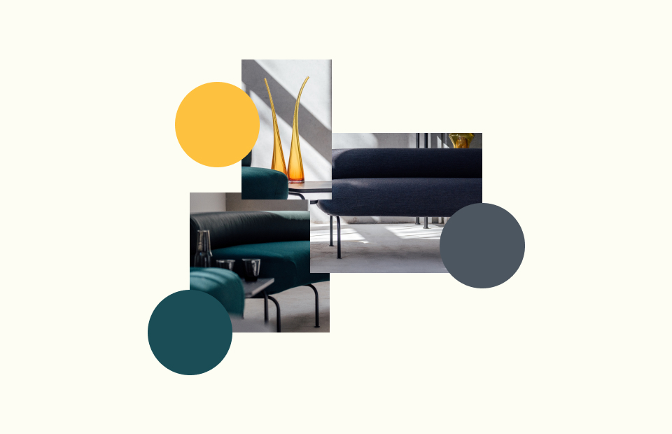
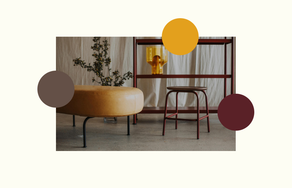
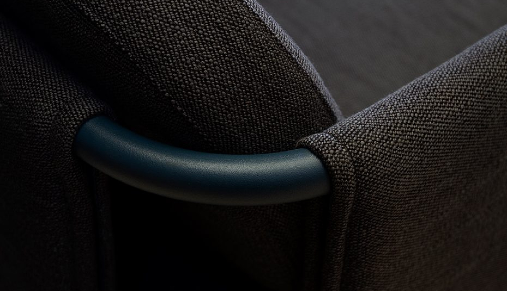
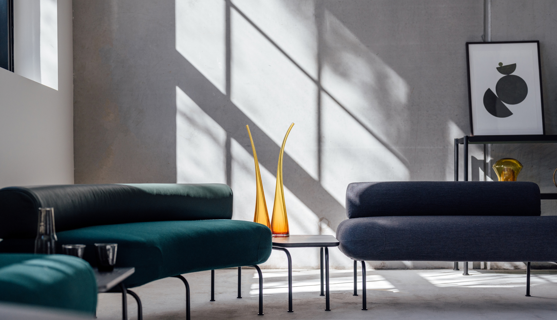
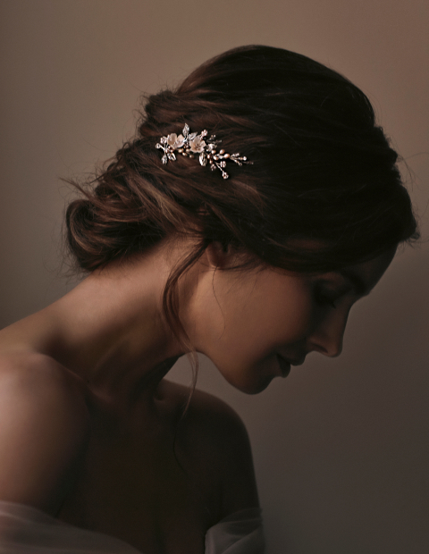
The identity was designed with a custom typographic solution, stripped back to raw, honest elements and inspired by the low, angular, refined furniture designs that have become synonymous with the designers’ aesthetic. Primary brand colours are neutral, with a seasonal secondary palette to reflect and complement current materials, collections, trends, marketing campaigns and photography. Paired with new type, the art direction now features a dark, moody photographic approach which utilises natural light and stylised scenes, evidencing the products’ compatibility with high-end home magazines and showrooms.
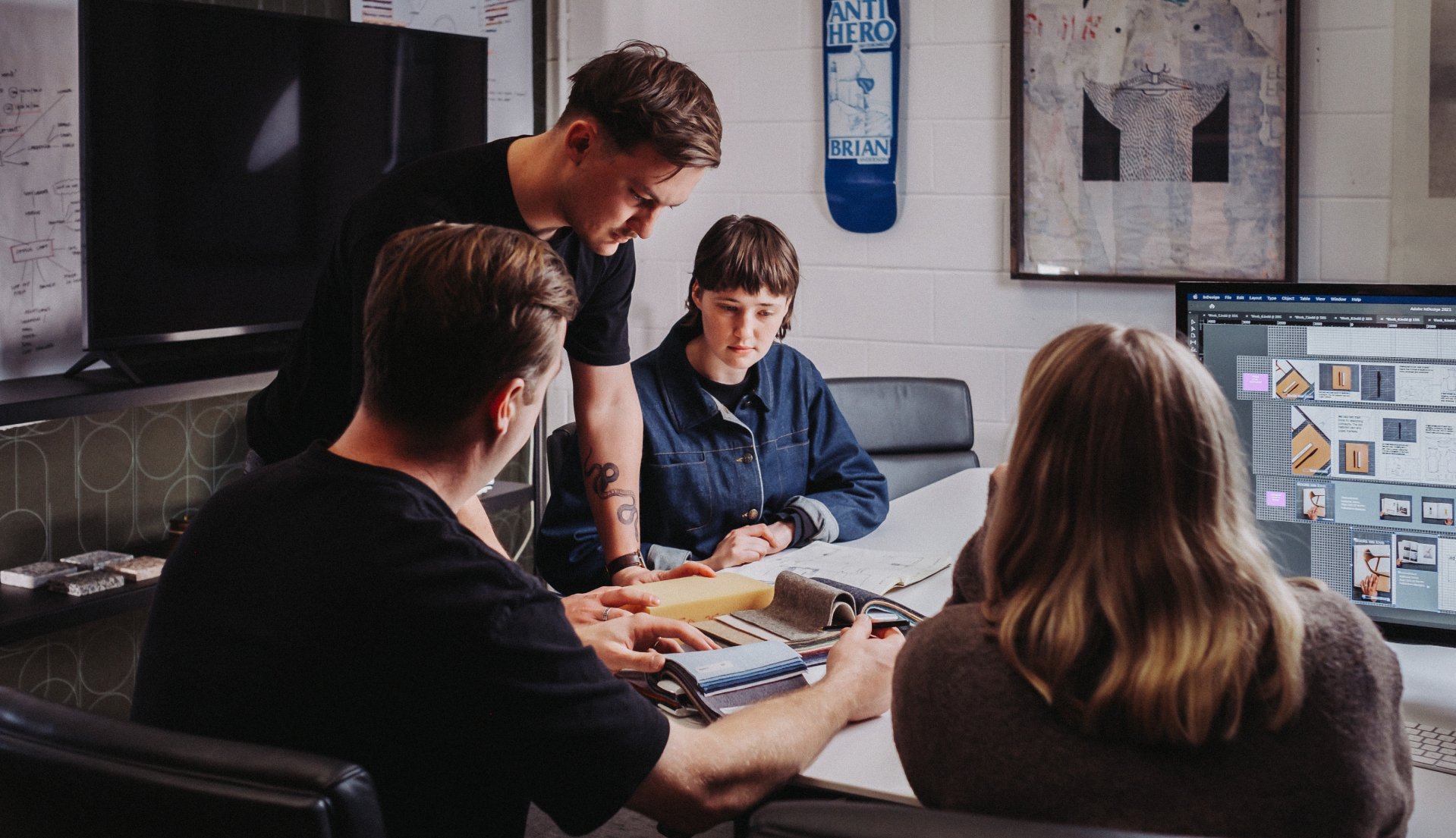
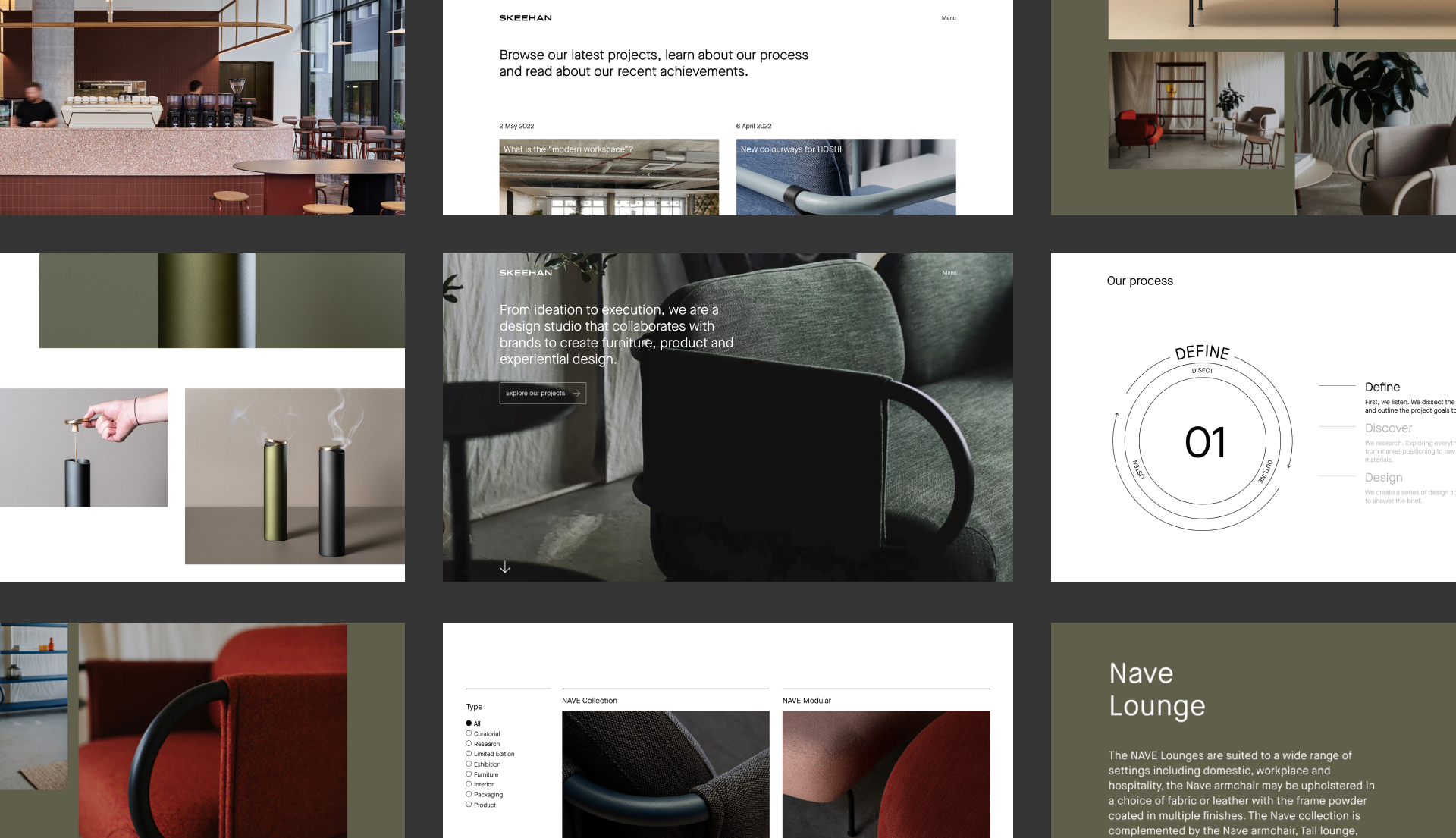
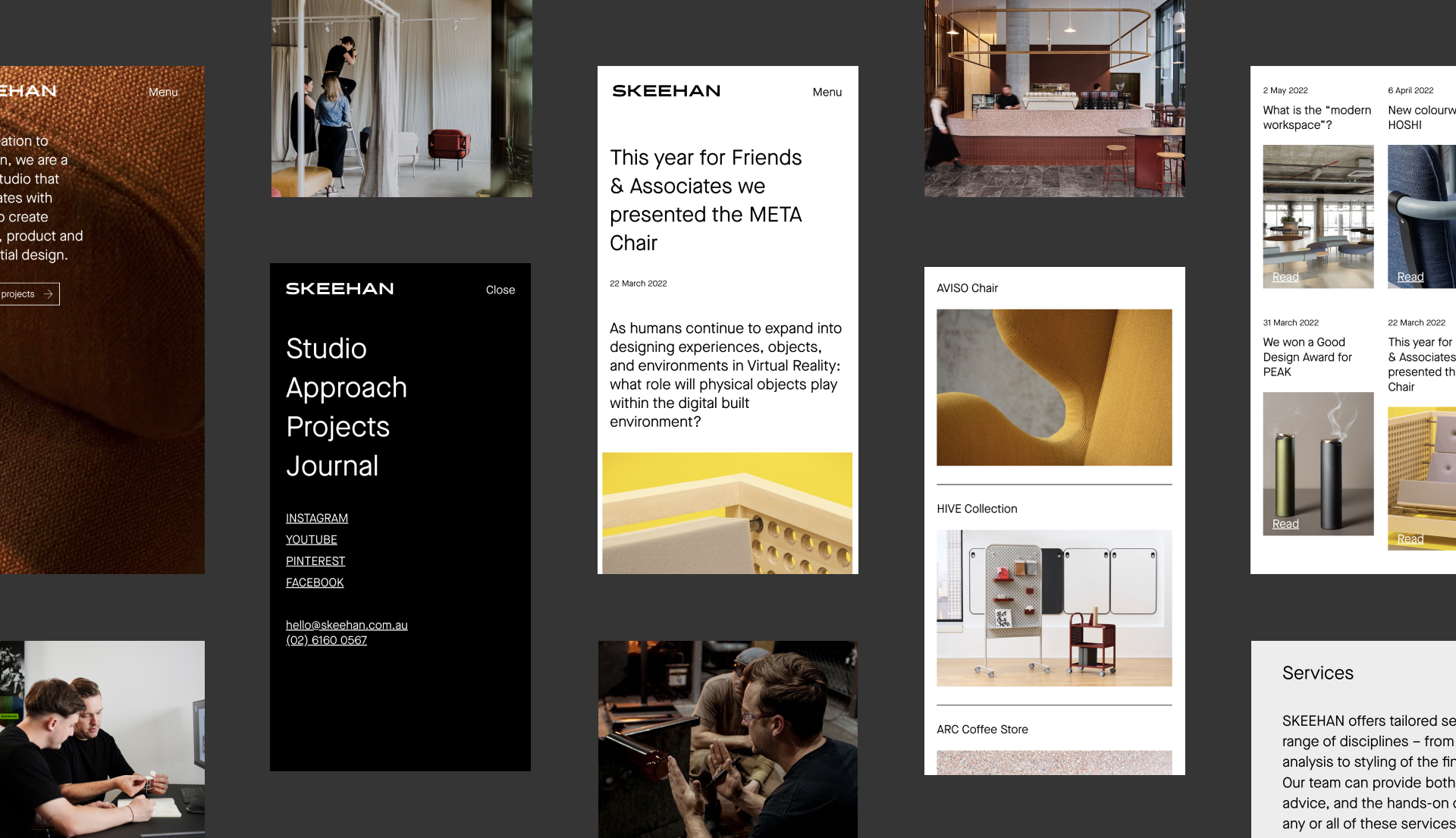
The website has been transformed into a valuable tool showcasing the products and projects with downloadable assets and imagery for designers, prospective clients and marketers to spec, buy and share the Skeehan brand. The use of video explains the studio’s process and highlights their capabilities. Layouts feature a loose grid that allows images to have structured freedom on the page, reminiscent of the design process with swatches laid out on a table.
