A modern expression of heritage, craft and workmanship

Mittagong Hotel has gathered weary travellers together in the Southern Highlands for over a century.

Challenge

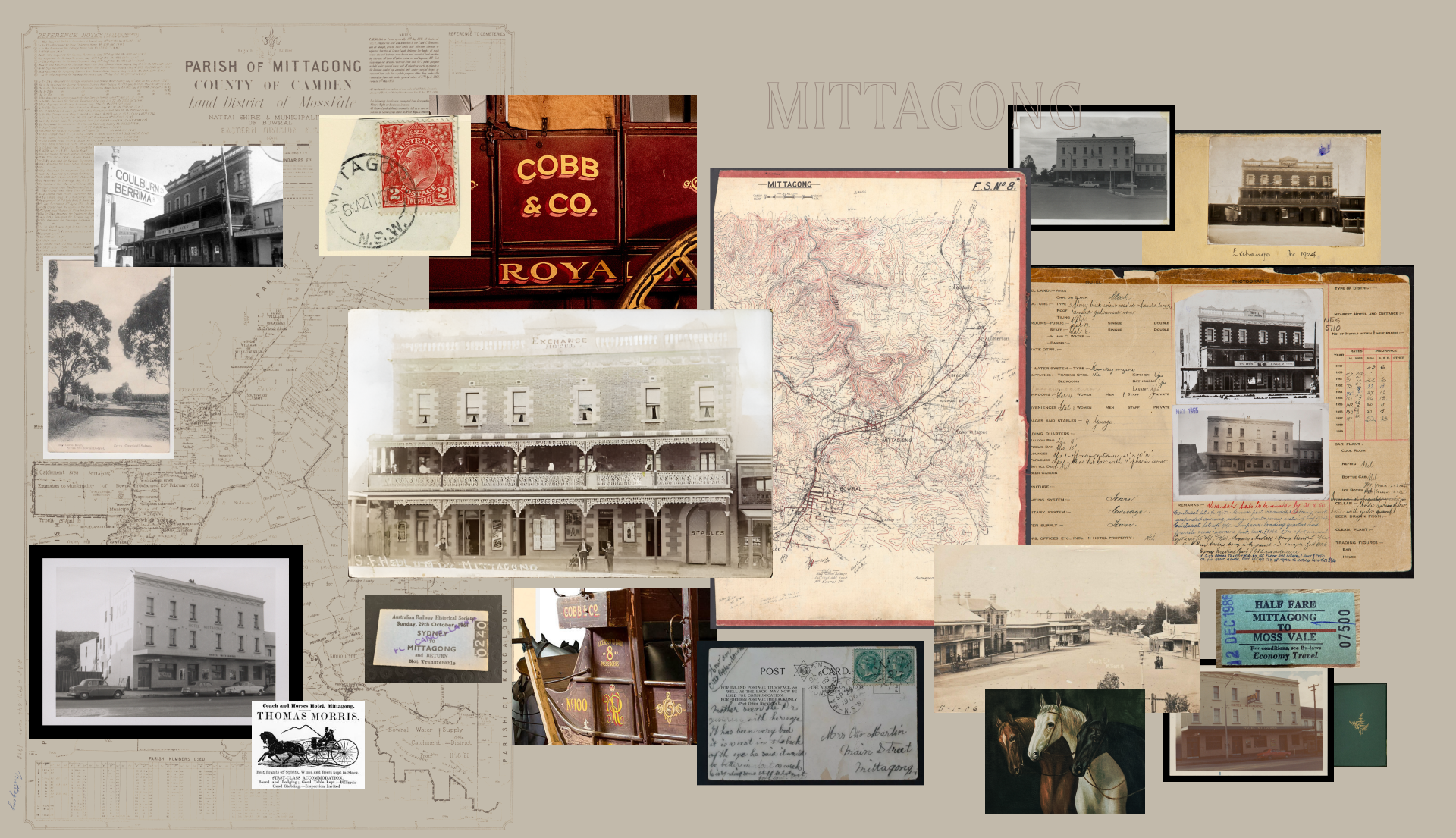
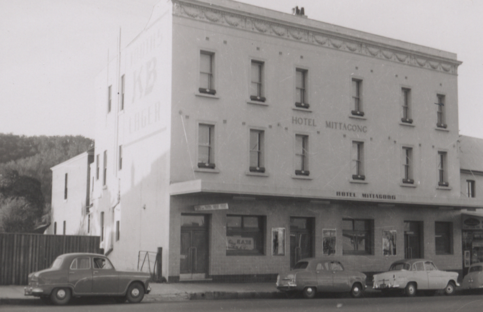
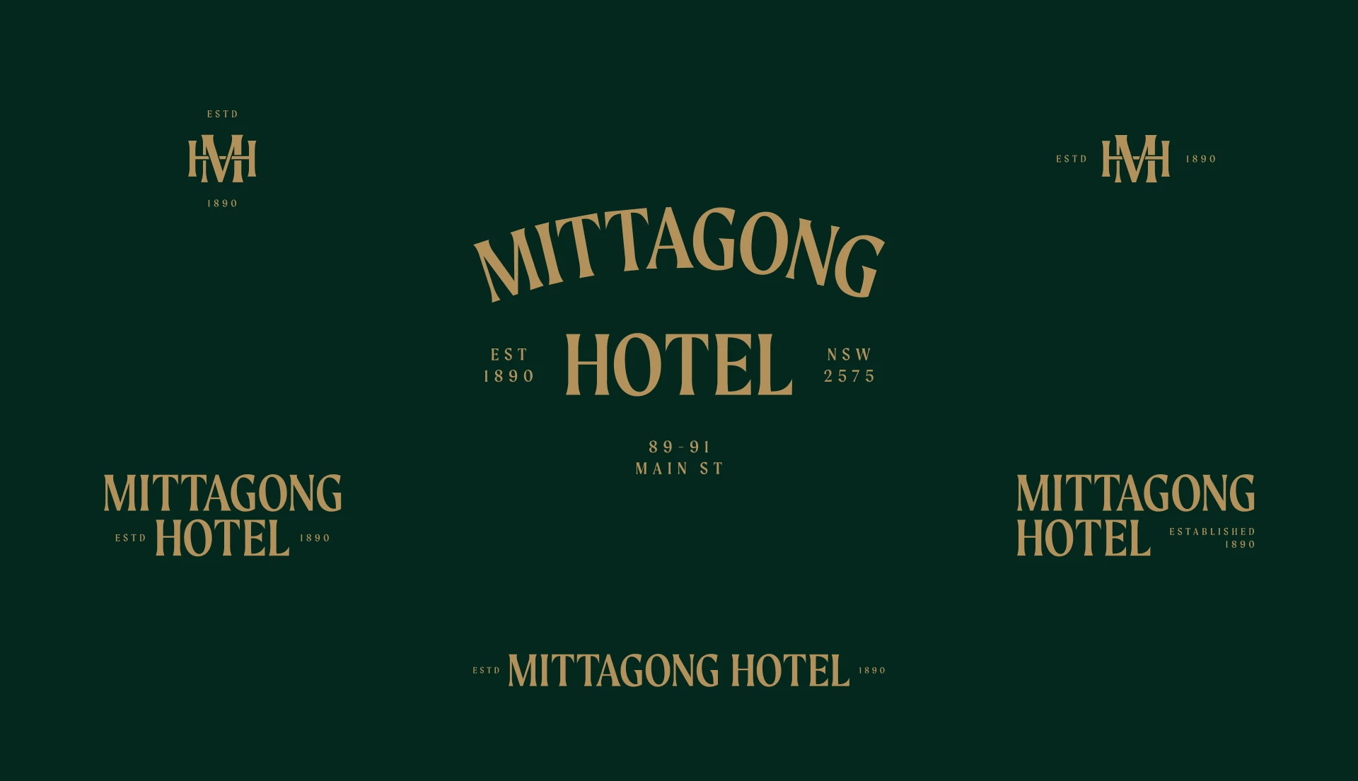
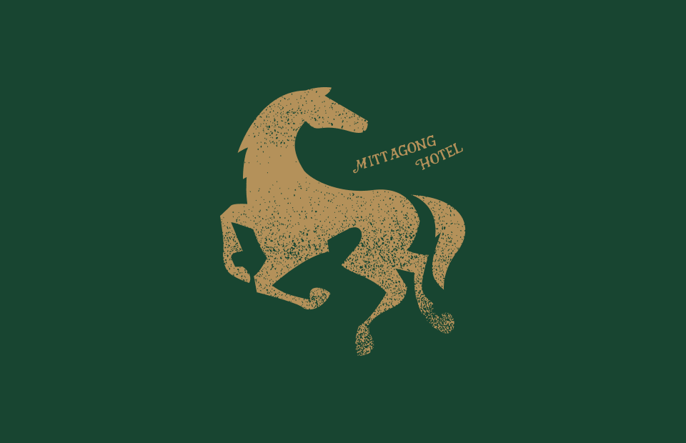
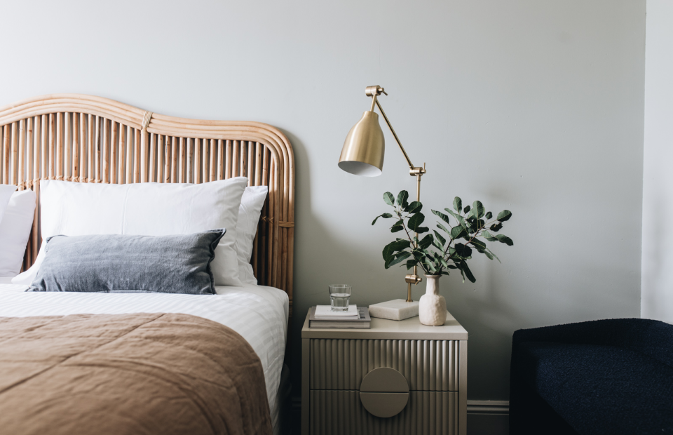
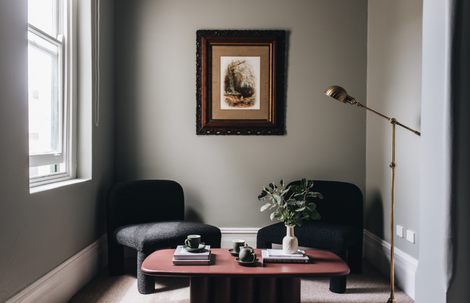
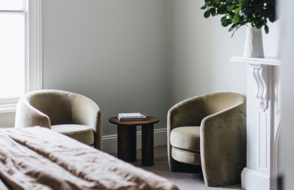
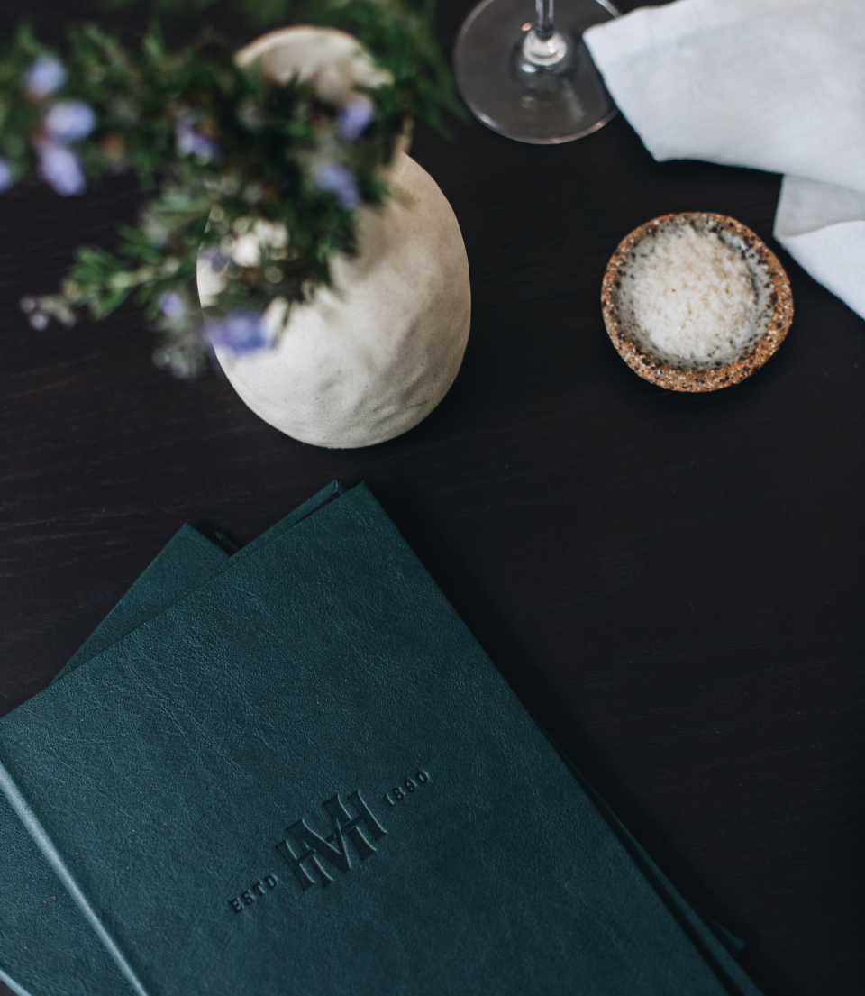
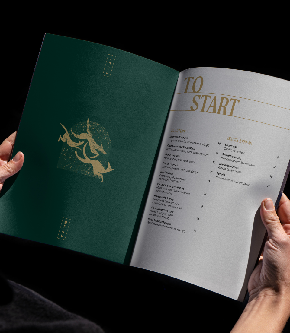
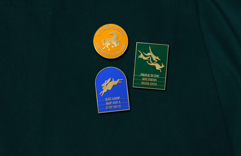
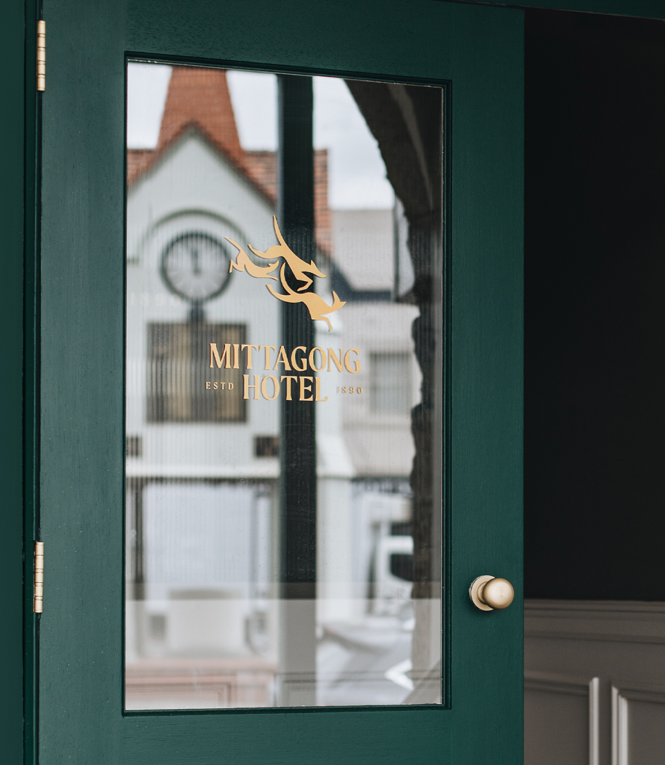
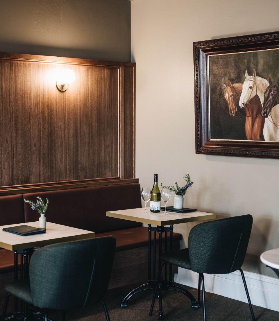
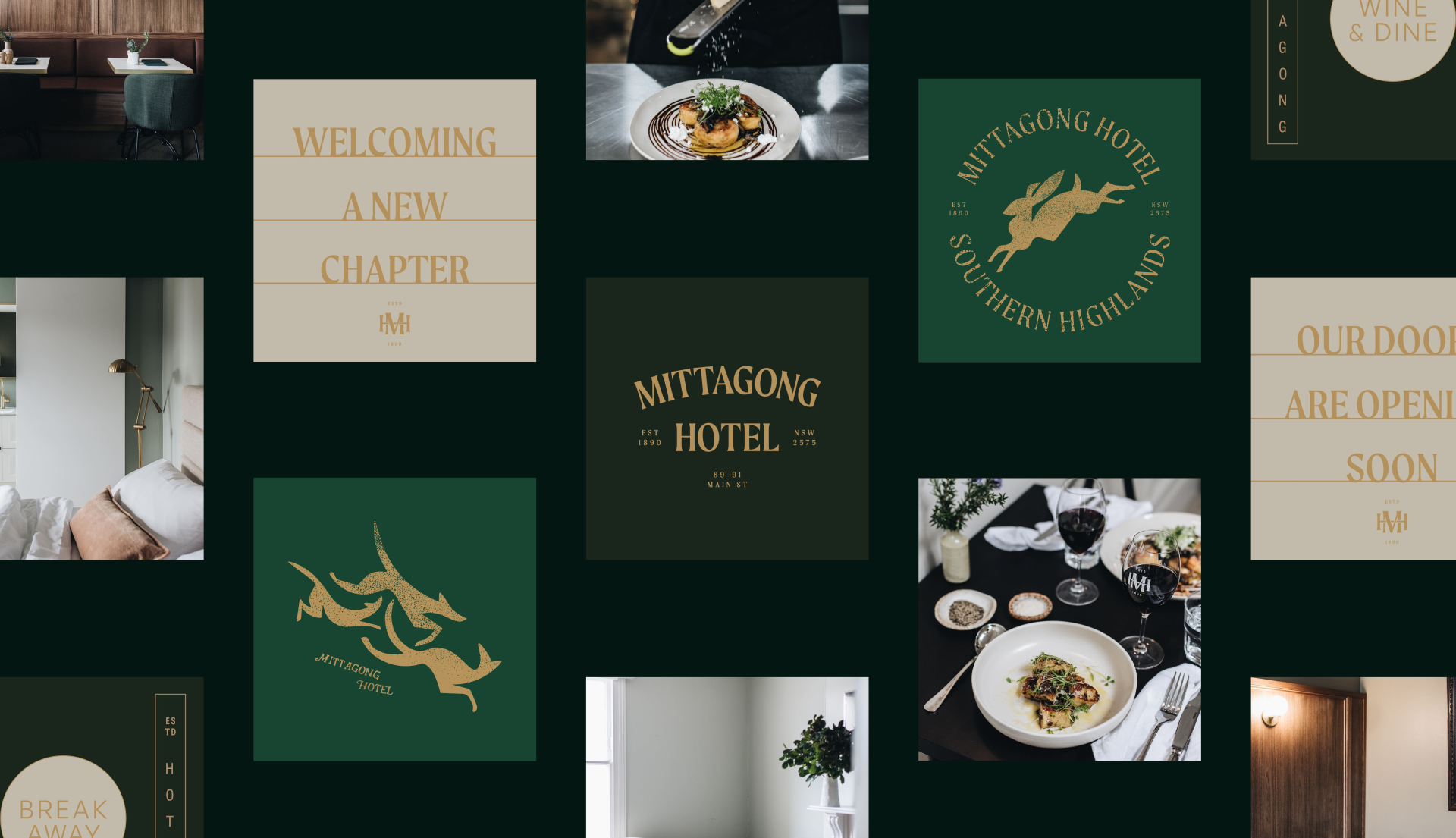
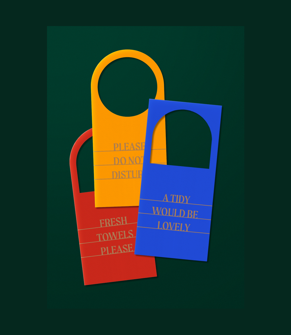
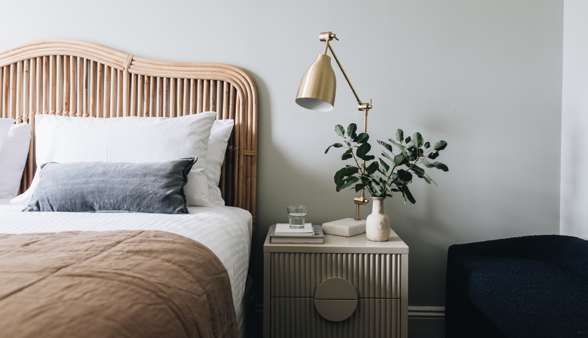
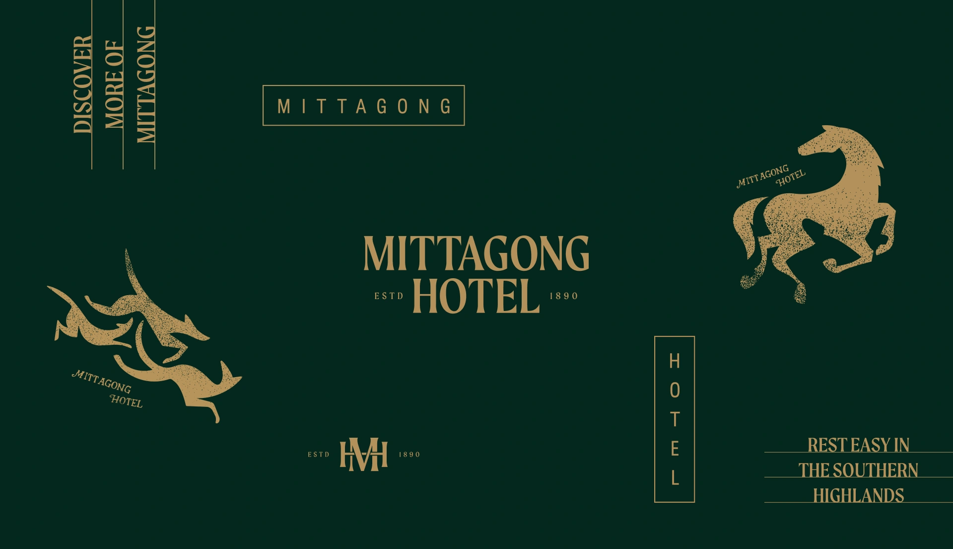
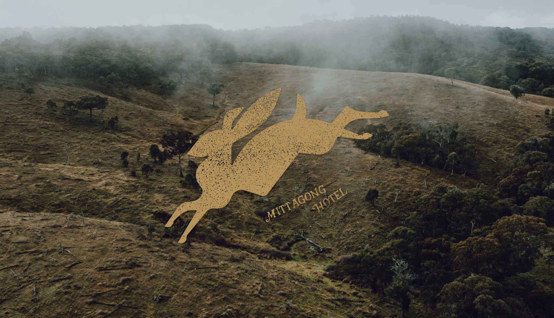
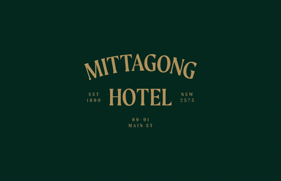
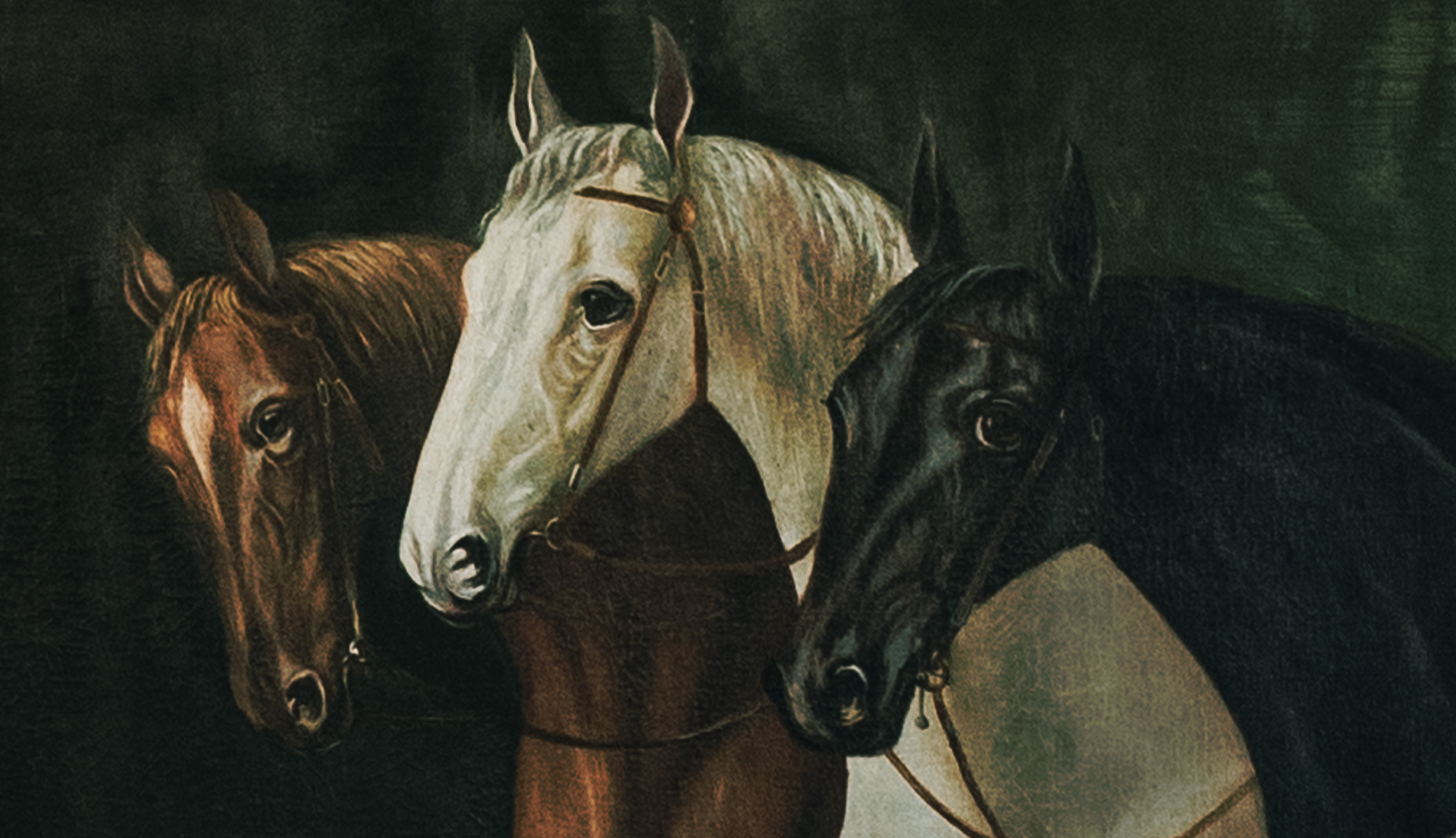
While undergoing significant renovations, the client approached Inklab to establish a sense of destination and an elevated look and feel for the venue. Our challenge was to develop an identity that expresses the unique character and working-class history of the region. Balancing comfort and cool factor, we envisioned an elegant and old-worldly brand with a lighthearted twist  – an attractive addition to the itinerary of the modern traveller, remaining relaxed enough for locals to frequent.

Solution

Our solution brings a sophisticated touch to the traditional Aussie pub atmosphere. We delivered a flexible brand comprising a suite of logo variations, a strong monogram, and an earthy, luxurious colour palette of lush green and gold. Traditional woodblock-style illustrations feature horses, hounds and hares, referencing the grand estates and getaways of the wealthy that once populated the surrounding landscapes. Their gritty, hand-assembled nature speaks to Mittagong’s working-class past and the originality of early craftspeople and labourers.

Delivery

  • Brand positioning and strategy
  • Identity and brand rollout
  • Illustration
  • Print collateral
  • Signage and wayfinding
  • Social templates
Moodboard images of historical images and references

Grounded in history

Originally a Cobb & Co coaching location, the heritage-listed site has since evolved into its current part-pub, part-boutique accommodation offering. A reworked take on 19th-century type takes cues from the original facade, connecting the hotel’s heritage to a tourist-focused future.

Historical images of Mittagong Hotel
Illustration of horse with the words Mittagong Hotel

Considered materials and installation

We collaborated with interior designers Sally Hieatt and Luci.d Interiors to ensure the seamless and integrated rollout of the new identity across all touchpoints. Venue signage complements the polish of the hotel, citing traditional techniques and application as originally applied throughout history. Wayfinding reinforces the hotel’s classic look and feel through simple, crafted applications featuring gold foil, brass and powder-coated steel. No longer a tired stopover, the approachable, inclusive venue is as obvious a choice for a weeknight pint or family meal as it is a home base for a luxe weekend stay in the highlands.

Collection of Mittagong brandmarks, typography and illustration