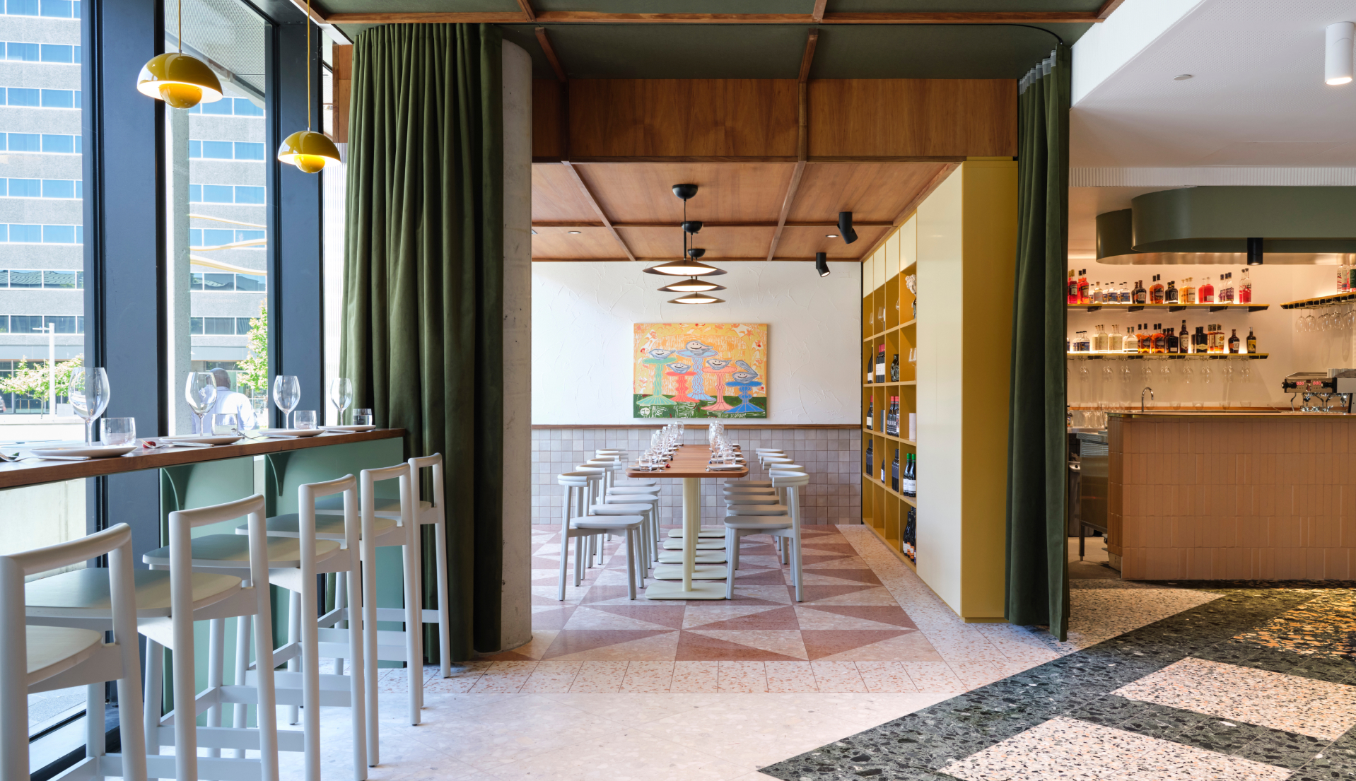
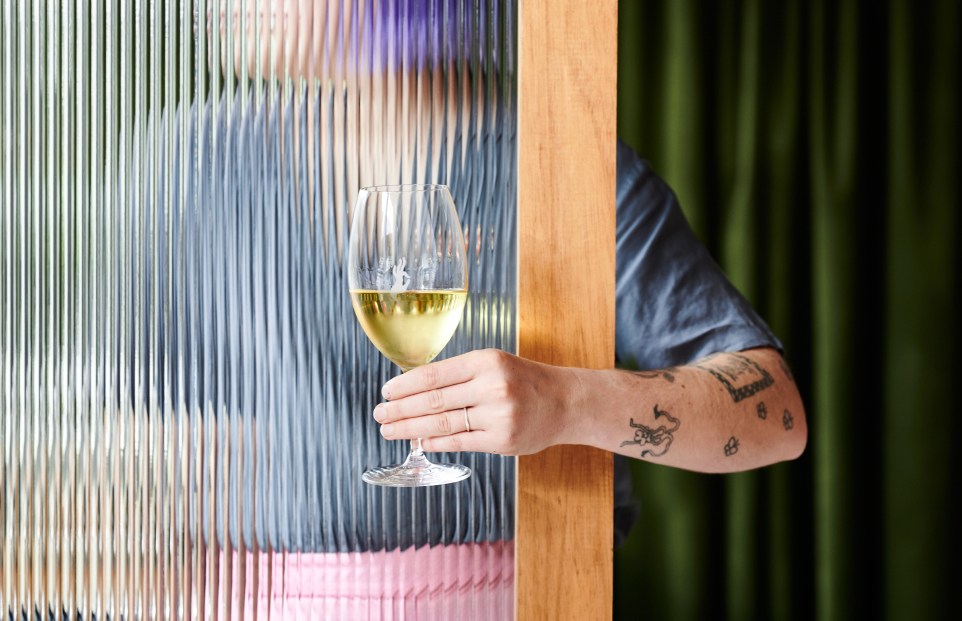
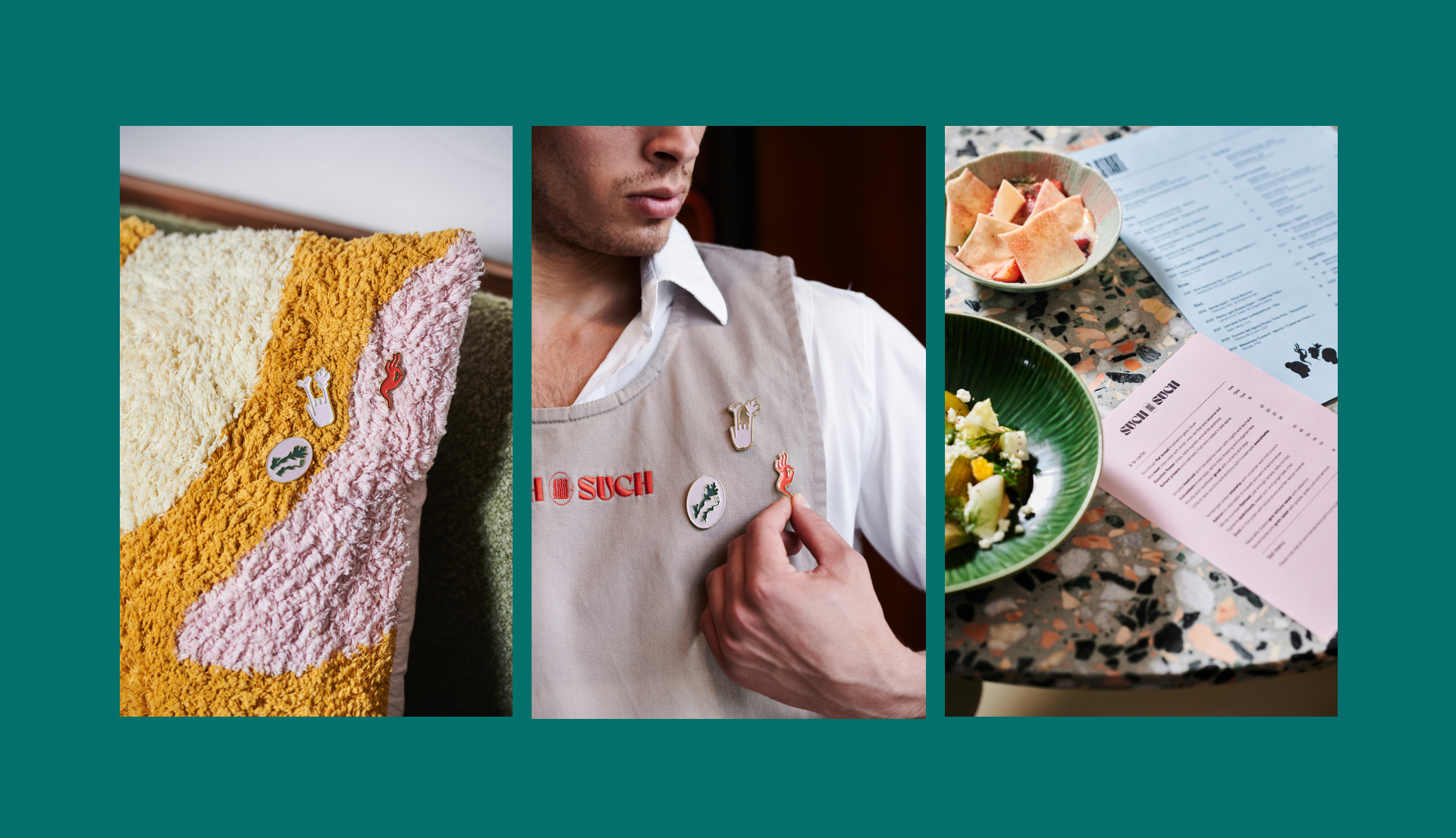
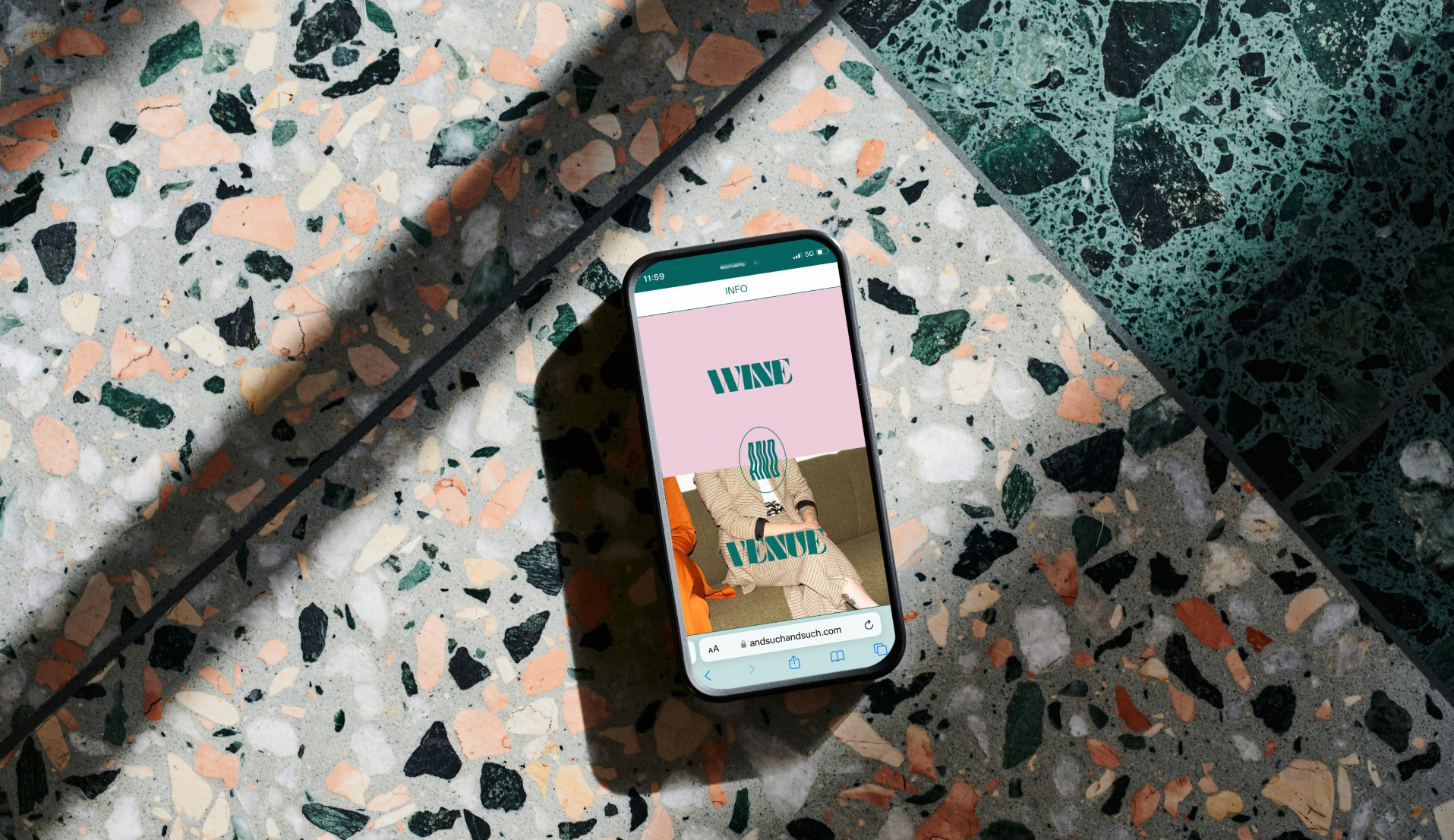
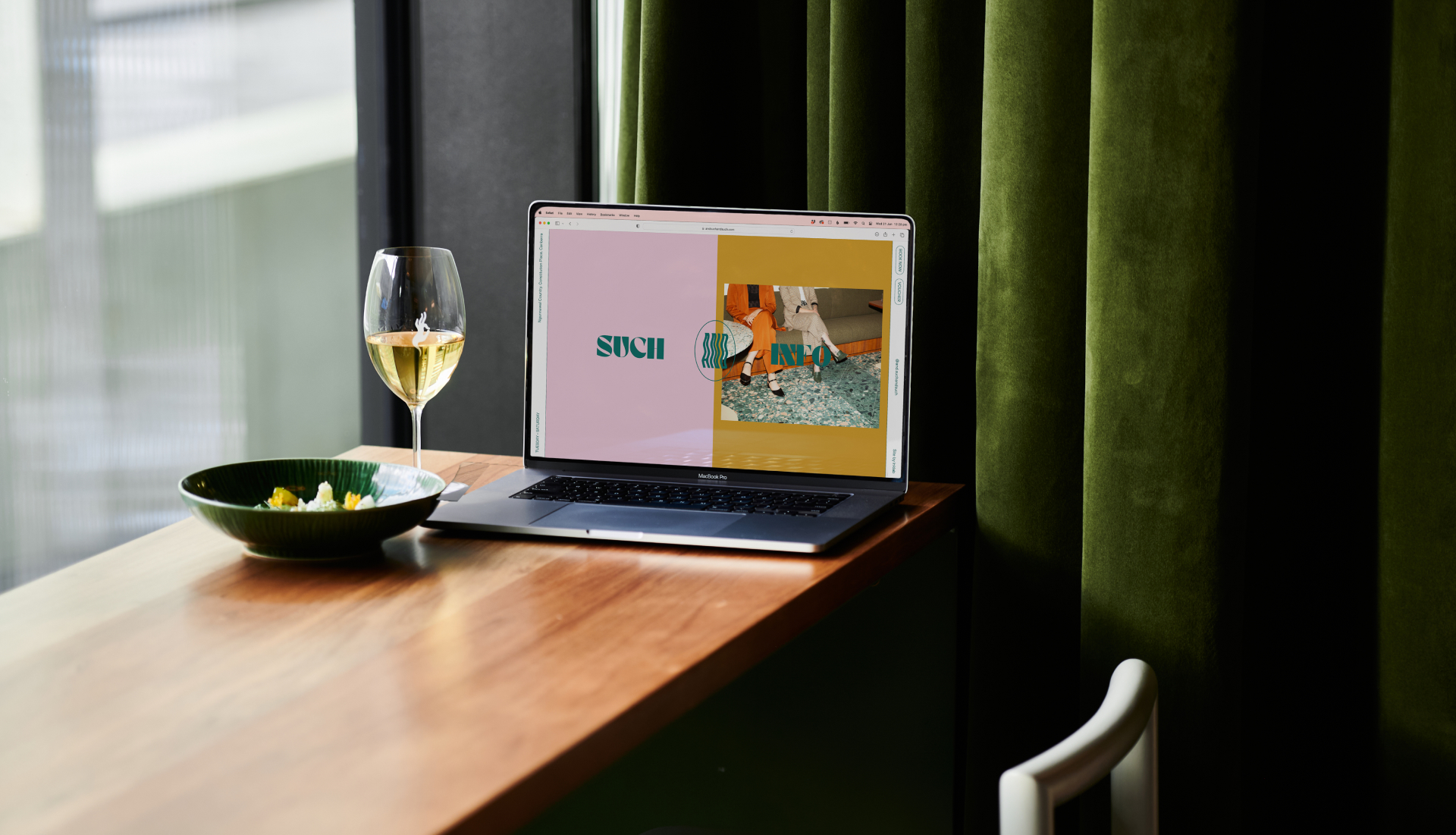
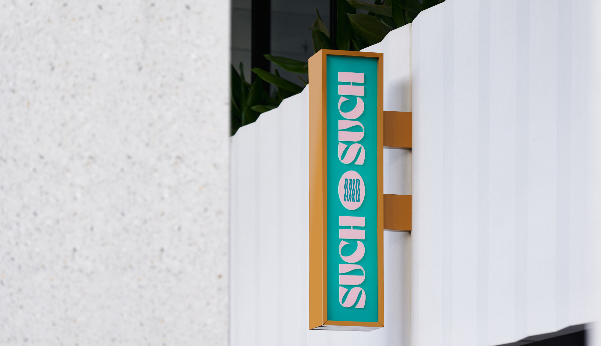
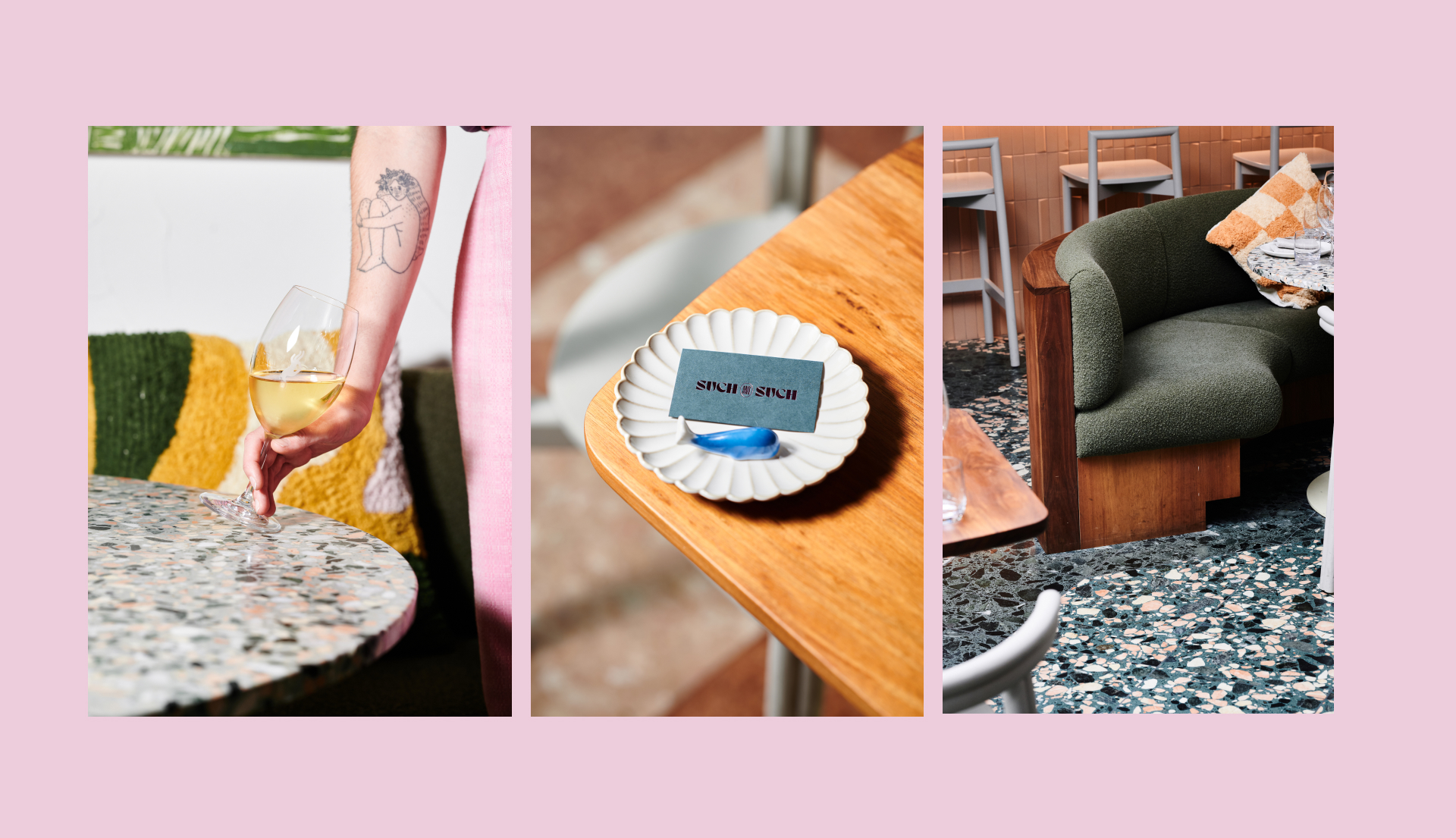
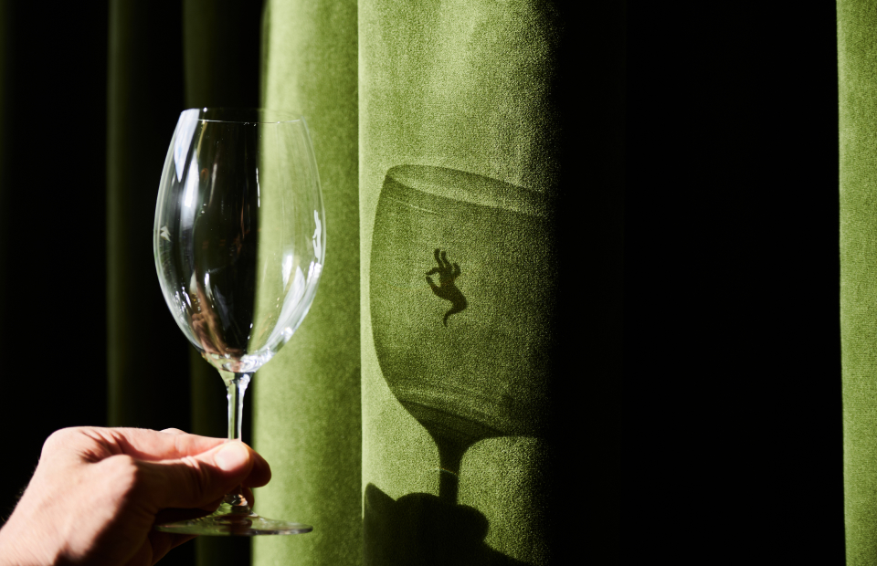
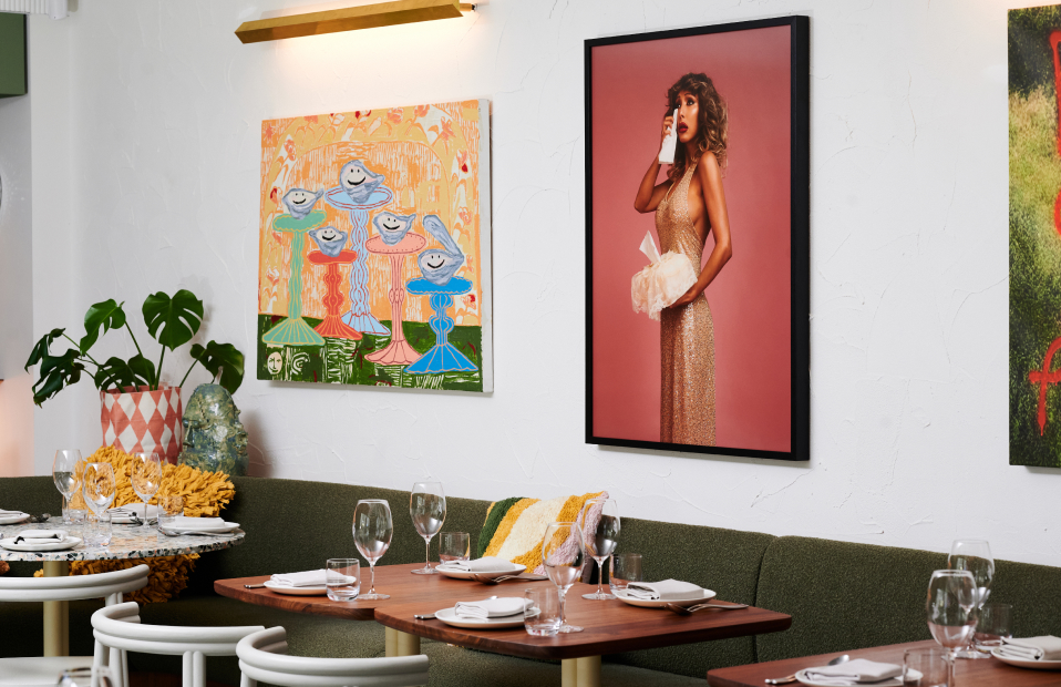
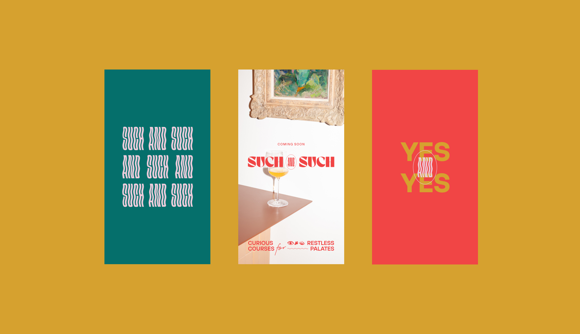
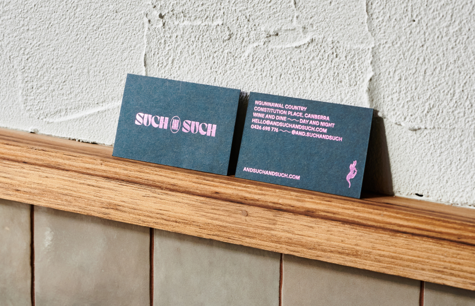
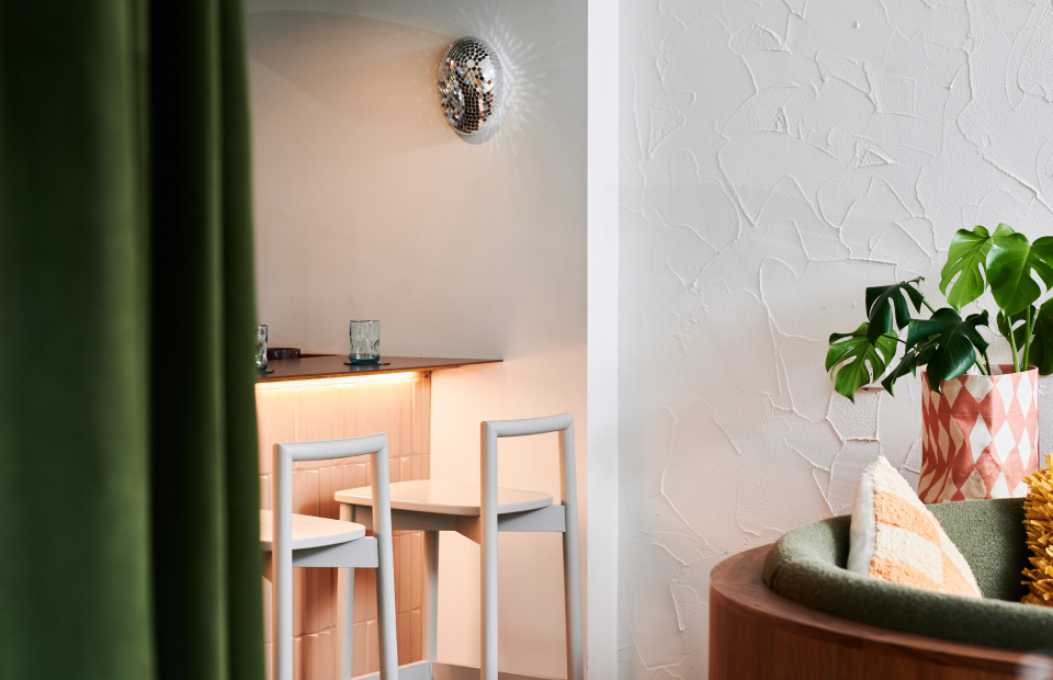
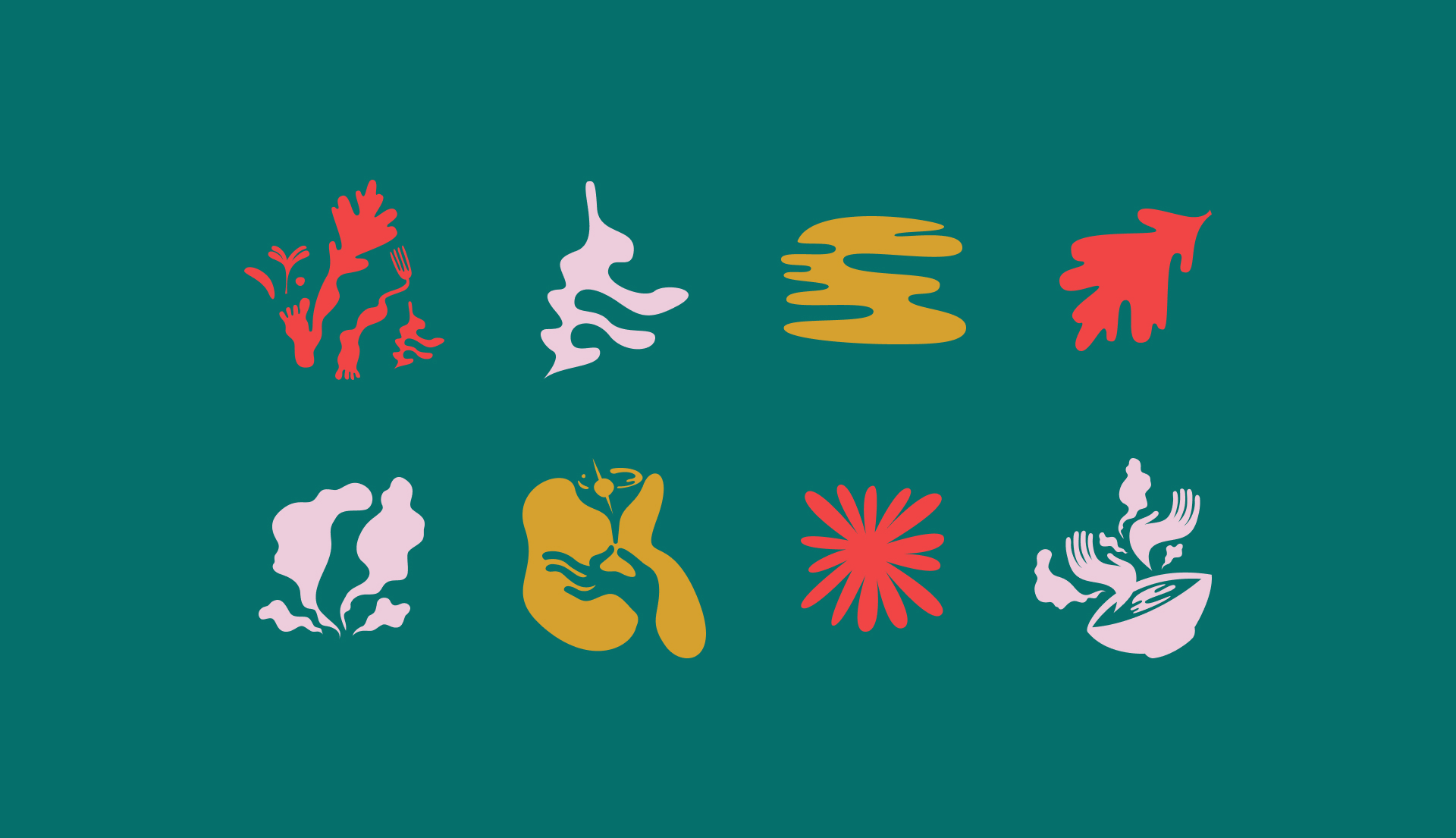
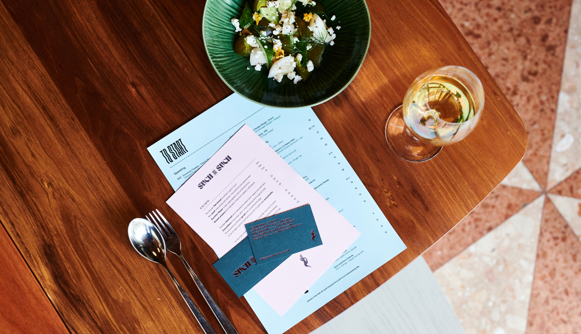
Amusing yet sophisticated, the name ‘Such and Such’ sparks conversation with its ambiguous, approachable nature. Taking cues from the name, colloquial-style copywriting uses ‘and’ as a conjunction to express ideas through familiar and unusual word pairings. Matching relaxed messaging with warped, wavy typography reflects the venue’s casual ethos. Direct-flash, high-contrast photography maximises impact and intrigue, while curvaceous, playfully surreal vector illustrations connect with diners through contemporary symbolism. While graphic materials provide moments of relief and clarity to enhance the user experience, the opulent colour palette stands out in application, rather than blending into the interiors. The website design provides immersive layouts, animations, quirky interactions, and easy access to information. As a result, brand, architecture and interiors combine to create a unique experience that, like dreams, is distinctly open-ended, difficult to articulate and most appreciated after a firsthand encounter.
